August 1, 2014

Browsing on small screens is a challenge
In the previous series of posts, I have outlined why the increasing number of mobile browsers being used on our school district websites led me to develop a new mobile website for the district. My next target was to build a similar mobile website for the high school, but my previous post described the problems our district has had with inconsistent websites, so I was determined that the two new mobile websites avoid those problems. I also needed to think about how to structure the high school mobile site to duplicate the functionality of the regular high school site, which is more complex than the district website, while keeping navigation easy and mobile-friendly.
In this post I discuss the deliberate design differences between the two mobile websites, features on the mobile site which helped address the complexity of the regular site’s navigation and content for small screens, the issue of when and how to redirect visitors to a mobile site, and designing alerts for the mobile site.
Similar but different
I needed to walk a fine line on how to make the two new mobile websites similar but different. I couldn’t make the high school mobile site look just like the district site, or users would become confused as to which site they were using. But I also did not want the shift from one to the other to be too jarring.
For the homepages, I used the same color scheme to unify the designs. But I used a different background color for the headers and adorned each homepage with a different upper-left corner graphic. I also used a different style of search and back buttons in the headers for the two sites.
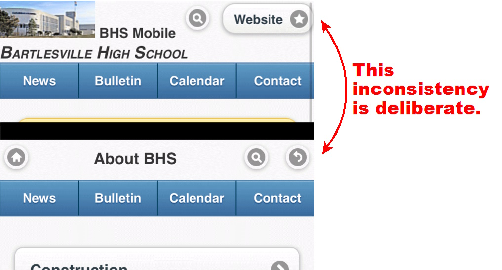
UPDATE: Later I changed the styling of the upper right header icons at the high school site to resolve some issues with title text.
If you play “What is different?” you should also pick up on how I deliberately inset all of the main buttons on the high school website, whereas the district site’s buttons extend across the full width of the mobile screen.
The most obvious difference was how I included on every page of the high school mobile site, including the homepage, a horizontal button bar at the bottom of the header. It matches the primary entries in the regular site’s top horizontal button bar with its entries for News, Bulletin, Calendar, and Contact. While having these functions always readily accessible is nice, I was really more motivated by how that would distinguish the high school site from the district one, which has no recurring button bar in its headers.
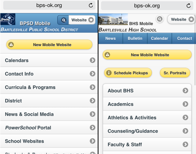
Different header colors and buttons distinguish the two mobile sites, along with the high school site’s header button bar
That way, no matter where you are in either site, there are several distinguishing characteristics to help keep you oriented. The limited screen size meant I did not want to expand the header to include more than a simple title on each page. People are always reluctant to scroll, so it is important to keep as many buttons visible as possible on the initial pageload. Below is a comparison of pages situated one level deep at each of the sites; note the various subtle changes.
I also used full-width buttons on the district site versus inset buttons on the high school site
When visitors did scroll down far enough to hide the header, I still wanted visual clues as to which site they were using. The inset buttons on the high school site were my solution, plus a different color scheme and button style for the footer. Since the footer concludes a page, I felt free to add “Bartlesville Public School District” to the district footer below its discrete buttons, but felt that adding “Bartlesville High School” to the high school footer’s button bar did not blend well with its rectangular design. So I put “BHS” on the central button itself.
UPDATE: Later I discovered how to keep the header visible at all times and opted to do that, although I kept the high school site’s button bar out of that always-visible header.

The footers of each site are also quite different
Navigational differences

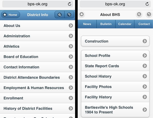
Resources page links appear only on the homepage of the BHS mobile site
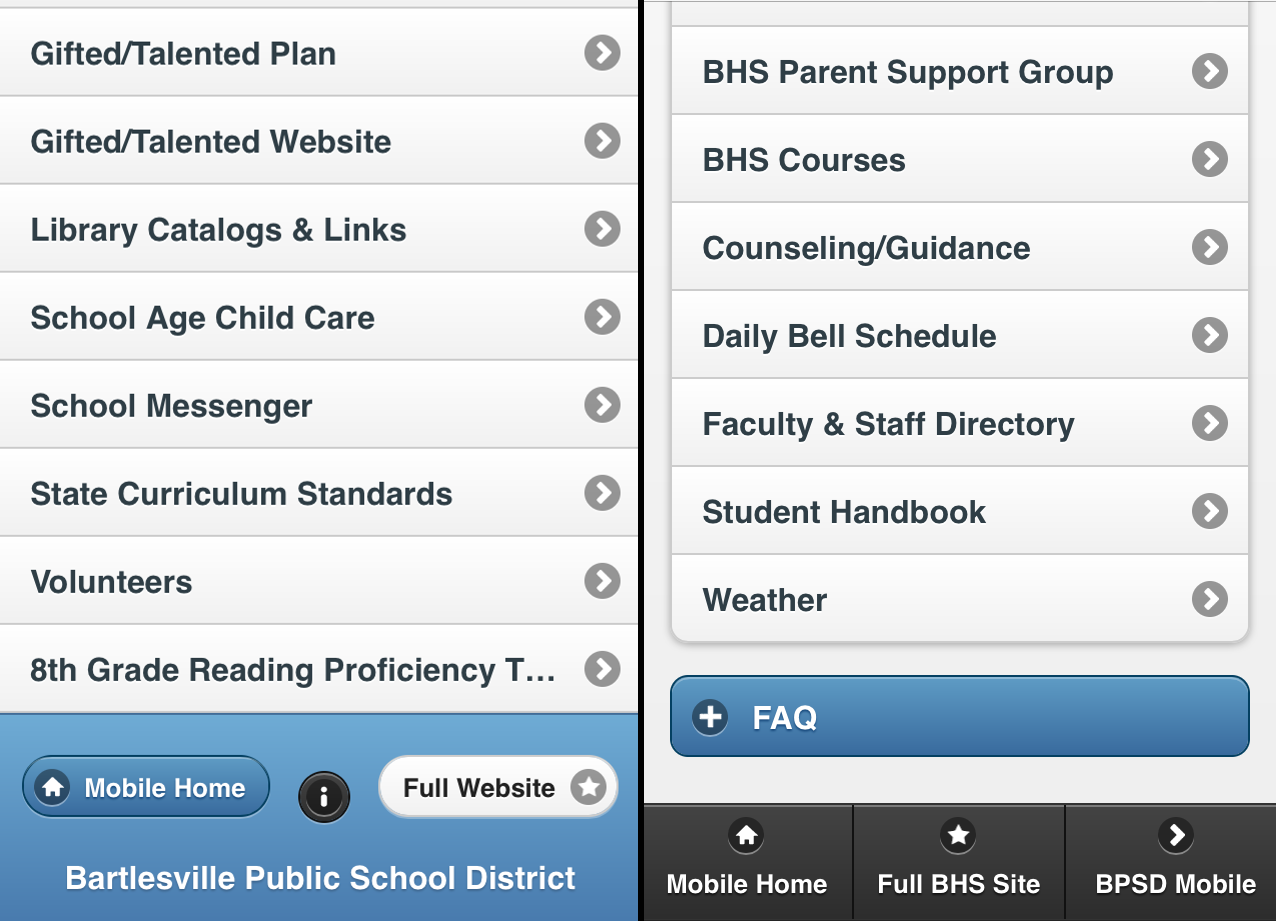
The comparison of the two footers also points out a navigational difference between the two sites. The high school site includes in its footer a direct link to the district’s mobile site, but of course the district site doesn’t return the favor.
Instead it just has a little information button which gives me credit for the site, provides an email link for feedback, and provides brief instructions for converting the mobile site into a homepage icon on iOS and Android mobile devices. That same information is more hidden on the high school site; it appears as a “Website issue?” entry in the Frequently Asked Questions nested lists in the various Resources pages.
Those Resources pages provide specific sets of links for students, parents, staff, alumni, and visitors. They’ve been a part of the high school site since 2009 and are thus carried over to the lower part of the mobile site’s homepage. They are a good example of the space dilemma one confronts on a mobile site, which does not concern me much on a regular site with plenty of screen real estate. While on the regular site you can always see those resources links along with several other sets of links, the mobile site steadily displays only a select group of links.
More complex navigation at BHS
The high school’s regular site has three main navigation areas: key functions in a top-of-page button bar, links to specific programs in a “Life at BHS” left sidebar, and the audience-targeted Resources links below that on the left sidebar. This is considerably more complex than the navigation at the district’s regular website, where everything is sorted into six areas with a single horizontal button/menu bar below the header (plus groups of links buried way down in the footer).
The more complex navigation layout for the high school’s regular website reflects the great quantity and depth of information on it; in some cases the links nest into one another four levels deep. For example, information on facility additions made in each decade are shown under:
About BHS > Facility History > Campus Additions > 1990s, etc.
To keep people from getting lost down there, selecting “About BHS” reveals a second left sidebar for that link’s entries there. Picking one of those links then reveals a nested button list of additional choices. I like using vertical sidebars for this because it keeps the various choices visible while also providing a continual reminder of where you are at in the structure by using boldface list entries, nested bulleted lists, and > signs. This is more powerful than simply displaying a linked chain of nested choices, a la “About BHS > Facility History > Campus Additions > 1990s.”
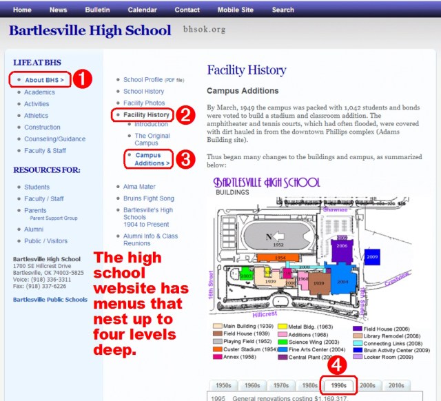
Multiple left sidebars on the regular BHS site keep visitors oriented in the deeper levels of the structure
All that has worked fine for the regular site, but a mobile site doesn’t have that luxury. No one wants to click on tiny text links which are always displayed; you want whatever you are looking at to be the main focus and to rely more on scrolling than anything else to stay oriented.
So on the mobile site I dropped all of the visible left-sidebar links; you have to go back to the mobile homepage to reach another “Life at BHS” area or access a different audience-targeted Resources page. But those links are always just one click away using either the Homepage button at the top left or bottom left of each page. Notice how they are both on the left side; consistency is important to website visitors.
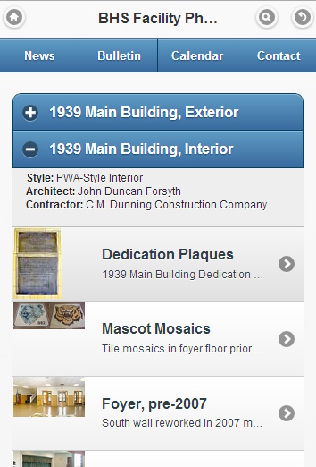
I used thumbnail list buttons for photos
And sometimes I just didn’t try to convert things into mobile format; the high school site’s extensive entries on school and facility history have no mobile equivalent. If you select them from the mobile site, it just plops you back in the regular site. The message is that if you want to read all of that text, go get a bigger screen. But for more visual items, such as the collection of facility photos, I did take the time to build out an elaborate set of pages with a link to every photo. And each of those links includes a thumbnail view of the photo it links to. That lets users select based on the photo itself as well its description. Selecting a photo link displays the photo, with a caption, in a pop-up window resized to the device display. That avoids creating another page and is visually and operationally more simple than using an accordion list, a feature discussed below.
Choosing what to include and what to omit
I also took the time to create full mobile versions of the faculty and staff listings, both the long alphabetized list and a departmentalized one, with the latter adding thumbnail photos and buttons for email and web links. Again what you include depends on your goal and the screen size: someone using the long alphabetized list is probably just searching for an email link, so don’t lengthen that list with thumbnails and big buttons. Just include a job title to help reassure them they have the right person.
Someone looking at the departmentalized groups is likely more interested in things like a photo and web links. Also note how the email buttons in the alphabetized list have labels showing the person’s email address username, reflecting the focus of that listing, while the departmentalized groups go for easy navigation with a big “Email” button. The limited screen size meant that the buttons in the alphabetized list had to be smaller so that long usernames could fit without line-wrapping an entry; for a long list you want to keep the entries a consistent size for easier navigation.

The long alphabetized list omits the thumbnails and website links shown in the shorter departmentalized groups
Accordion lists
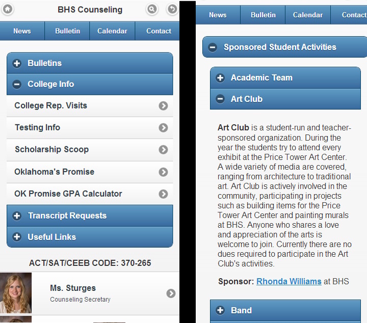
So what else does the mobile site use to tame the navigational complexity? One trick I used a lot was expanding “accordion” lists. Those are single or grouped buttons which don’t load another page when tapped, but instead open up to reveal information or another set of links. That allows the mobile site to have fewer pages while keeping a page from getting too long. You expand the page only when asked, plus when someone opens another area in the same accordion group, the previously open area closes as a new one opens. That keeps the page from expanding again and again to awkward length and speeds up navigation. The user can scroll just outside of the currently opened item to quickly select other items above or below it, and also scroll more quickly to the header or footer.
All that is well and good, but the user has to realize how it works. So you want the accordion list to be clearly different from a regular button that goes to another page. jQuery swaps out the usual > icon at the right edge of a button with two different icons on the left end of accordion buttons. A + icon appears on closed items and a – icon on open ones. That is pretty clear guidance as to what is going on.
jQuery also automatically insets accordion lists, but on the high school site I was already insetting entries and I didn’t like mixing full-width buttons with inset accordions on the district site, so the insets wouldn’t help distinguish the accordions. Thus I chose, on both mobile sites, to emphasize that accordion lists were different by changing the colors of their buttons. I made them blue so that when an item opened up, the blue buttons of the neighboring accordion items would form obvious borders to the opened content. That would help folks realize what was going on when they scrolled out of larger opened items.

Accordion lists are a great tool for mobile sites

The FAQ accordions use smaller buttons to fit more questions on the screen
The screenshots show I used accordion lists both for sets of links and textual information. On the right is an example of a nested set of accordions; a large “Sponsored Student Activities” entry is part of an initial accordion list, but when you open it you find another set of accordion entries for the various organizations. That lets you build a lot of information into a small display space without requiring endless scrolling.
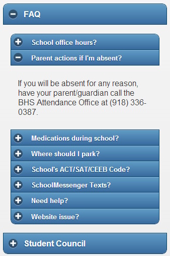
A variant on the nested accordion is the FAQs on each resource page; I used the “data-mini=’true'” option there to fit more of the FAQs onto the screen. The smaller button also reduced the size of the button text, allowing me to squeeze more question text onto each button.
Form select menus
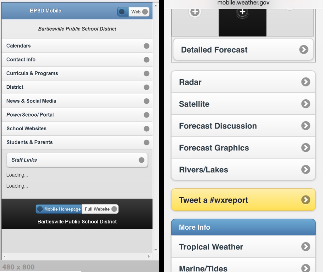
Another trick I used to squeeze more onto the screen was form select menus. Website forms include various functions such as text input bars, radio buttons, checked items, sliders, toggle switches, etc. But the select menu is what interested me. A form will then display, using the operating system’s own formatting if you like, a list of items the user is to pick from. This is best used for a list of closely-related items which is too long to comfortably fit on the screen.
I used this type of input for state report cards on the district site, since there are so many different groups of them and every group had the same list of school sites. Accordion lists were not a good choice in that case because one expanded entry would look just like another: a long list of the same sites. You could easily get confused as you scrolled back and forth.
By using a select menu, I could keep more of the different groups of reports cards visible and let the device’s software provide the most convenient method of selecting an item. For example, opening a select menu on an iPhone produces the three-dimensional illusion of a scroll wheel of items on its small screen, whereas opening the same menu on an iPad produces a text box of entries for you to pick from on its larger display. The iPhone’s styling makes it easy to scroll and select an item with your thumb as you hold the phone. The iPad is likely used two-handed or while propped on something, so tapping with a finger on an item in a smaller text box is more practical on it than on a tiny phone.
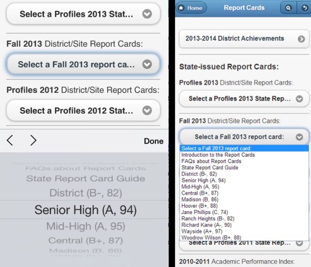
Form select menus render differently on iPhones versus iPads
“Go Back” buttons and a deliberate inconsistency

The homepage swaps the go-back button for an escape hatch
Another important navigational feature of a mobile website is the “Go Back” button, which displays the previously viewed page. In an environment with limited navigational controls, users often want to return to where they just were to select a different item or re-orient themselves. Nowadays many mobile browsers, such as Safari on iOS, maximize the screen real estate for a webpage by hiding the usual address bar and forward/backward web navigation buttons. That meant I chose to include a “Go Back” button at the top right of every page of each of the mobile sites to make that an easy option for the user.
But that isn’t quite true; there is one page at each site which lacks a “Go Back” button…the homepage. Why did I create this obvious inconsistency? Because the homepage is special; it is the anchor for all of the site’s navigation. You can go back to the homepage, but then you are not allowed to easily “Go Back” to a different level in the webpage’s structure. That emphasizes that the homepage is the starting point and also prevents someone from tapping the “Go Back” button repeatedly and having page-load latency mean they start looping wildly through the site.
So on the homepage I replaced the “Go Back” button with a large labeled button that takes you to the regular website. That killed two birds with one stone: it got rid of the “Go Back” button on the homepage while replacing it with an important feature for that page: the escape hatch. I will soon begin redirecting anyone who visits the regular websites’ homepages on a small screen to the corresponding mobile homepage. Below I’ll explain why I’m being so pushy, but I also know that anytime I force someone down a different path, I had better provide an escape hatch in case they didn’t WANT to be redirected.
Sometimes people don’t want to be on the mobile site; they want the regular site even on their tiny screen. So a mobile site should always include an escape hatch on every page; I included it not only at the top of the homepage but also in the footer on every page of the mobile sites.

Will that mobile user really be happy about the redirect?
The controversy on mobile site redirects
Informed people argue back and forth about whether someone trying to access a regular website on a mobile device ought to be redirected to the mobile-friendly site or not. Since many people will not discover the mobile-friendly site on their own, and it improves the web experience so much on tiny browsers, I think folks should be redirected to it when they are using a small screen. But you have to include an escape hatch in case they prefer the regular site, get confused, or somehow the redirection occurs when it shouldn’t.
Once I decided I did want to redirect, the next question was when and how. Web browsers include in their page requests information about the viewing screen size, the browser make and model, and the device. Any of that information can be falsely reported, but it does let you detect when someone reports that they are using a certain browser, device, or screen size. So when do you decide to force a redirect?
Some people argue that you should only redirect specific devices. For example, redirect iPhones but not iPads; redirect iOS and Android devices, but leave alone less popular devices which may not properly display the mobile site. Others argue that you base the decision on screen size, and I agree with that view.
I cannot take the time to maintain code to test for the latest and greatest in the blizzard of devices coming onto the market. And the whole point of the mobile site is to make things easier on small screens. So I wanted the redirects to occur when the screen size was smaller than a tablet’s typical resolution, thus targeting smartphones.
As for how to accomplish the redirect, the simplest choice seems to be this bit of Javascript code in the webpage header of a regular site’s page:
<script type=”text/javascript”>
if (screen.width <= 720) {
window.location = “mobile/default.html”;
}
</script>
If someone loads the page while on a device with a display that is less than 721 pixels wide, they’ll be redirected to the mobile website. I plan to activate this code on the homepages of the respective regular websites, but I did not want to do that without warning. No one likes big surprises, especially the average joe who is not overly familiar with web interfaces.
Of course redirection really isn’t as simple as the above code snippet. If that were all I did, then problem a) would occur: someone using the link on the mobile site to see the regular homepage would just be redirected back to the mobile site again. That has to be prevented, along with problem b): someone on a mobile device selecting the regular homepage, navigating elsewhere on the site, then returning to the homepage only to be redirected again to the mobile site. Problem b) is fairly common merchant sites, even large operations, and it is very annoying.
I could alter the links to the regular homepage throughout the mobile site so that the redirection code is disabled when they are used, but that would only fix problem a). Setting a session “cookie” that requests the regular site instead of the mobile site is a better solution. (A “cookie” is a bit of information you ask the user’s browser to remember for you; session “cookies” only last during a given session with the browser, while permanent “cookies” are stored for use in future sessions.) I might also use a “landing page” approach where small-screen users hitting the regular homepage are always asked if they prefer to see the mobile or the regular site before proceeding, with a timer that eventually kicks them to the mobile site if they don’t respond. I’m not used to doing any of this, since the only redirection I’ve used previously is a simple timed or immediate redirection to a new page when someone visits a page that has been superceded by some replacement located elsewhere.

A mobile link was added to the header of every page on the regular district site
All of this complexity meant that when the mobile websites launched, I did NOT include the redirect at first. Instead I mentioned in the news announcement about the sites that in a couple of weeks users on small screens would be redirected, with an immediate reassurance that a link back to the regular website would be available on every page of the mobile sites. That provides a sense of fair warning. Meanwhile, I added a mobile link to every page of the regular sites so that folks could trigger the mobile site if needed. And I made sure the various links between the regular and mobile websites matched up: the mobile button on the regular search page takes you to the mobile search page, while the regular-site button on the mobile search page takes you to the regular-site search page, and so on throughout the sites. This helps users recognize that every page has an equivalent on the other site and access it more readily..

The high school site header bar also got a new mobile link
I decided to not include a redirect on pages other than the homepage. I did not want to drop someone into the mobile site willy-nilly; a forced redirect only occurs on the homepage. That way if someone uses a link to a sub-page on the regular site, they’ll always see the same thing. I don’t want links to sub-pages to give varying results; that sows confusion. And if someone is going to save and distribute links to sub-pages, I want those to go to the regular site, not the mobile site: the mobile site is NOT suitable for a large-screen display. Someone on a small screen who follows a link to the regular site can always invoke the mobile site with the links I’ve included in every regular page’s header.
UPDATE: When I implemented redirection for both of the mobile sites on 8/14/2014, I used a script installed only on the homepage of each regular website. The script checks the screen size and if it is less than 721 pixels it displays a dialog box. The visitor chooses “OK” to be redirected to the mobile site or “Cancel” to stick with the regular site. The script is smart enough to notice if the visitor just came from the mobile site’s homepage and in that case suppresses the dialog box and displays the regular homepage. This approach avoided having to modify every link to the regular sites on the mobile sites to include a cookie and then having to check and clear a cookie to avoid redirection loops. I think visitors can tolerate the minor inconvenience of the dialog box appearing when a visitor tries to visit the regular homepage on a small screen.
Alerts

BHS Mobile alert page
Another precaution for the forthcoming redirection of small screen users is that I put a “New mobile website” alert button on the mobile website homepages. That provides an explanation for when the redirects begin and for folks who stumble into the mobile site on their own. Alerts are important for these sites for notifying visitors of inclement weather closures, vital deadlines, etc. I use blue and red-bordered text boxes for alerts on the regular high school site’s homepage, and a scrolling marquee on the district site’s homepage. Those elements simply disappear if no alerts are in effect. For mobile, it was obvious to put a big yellow button for an alert right below the header area. But then what?
Should the alert button link to a pop-up box? How about a separate page, kept in its own file on the server? Neither of those options worked out, although I tried both of them. I thought a pop-up box made sense, but when I implemented it in jQuery Mobile 1.2.0, closing that pop-up box was a problem. Sometimes I fumbled with the close target on my iPhone, and I noticed that re-invoking the alert made closure even more difficult. Also, while I had used pop-ups to enlarge photographs on the site, they are problematic for text. What if the text exceeds the screen area? Do you really want to scroll a pop-up? That isn’t intuitive.
So I gave up on pop-up alert boxes and tried invoking a dialog box loaded from a separate server file. That also suffered from the hard-to-close problem and the scrolling-box issue, and also meant I’d have to edit both the main mobile HTML file and a separate alert HTML file for each alert. That was too much work, especially since some alerts need to go up ASAP.
So I finally just had the button link to another internal page in the main HTML file, but coded that page’s header with a yellow theme, eliminated the usual header button bar on the high school site, and included a dedicated button at the bottom of the alert text to return to the homepage. Each of those changes would emphasize that an alert was important, different, and fell outside the usual navigational structure of the site.
That wraps it up
That wraps up my five consecutive posts on web development:
If you are a school district patron, I hope you enjoy using the new mobile websites. A lot of thought, care, and time went into their design and development; I sure hope it pays off for you.


 Meador Manor