
July 30, 2014

Mobile browsing was once impractical
Yesterday I posted about how my various websites are a mix of hand-coded HTML and hosted free services. Google Sites offers an option to “Automatically adjust site to mobile phones” which will try to sort things into a single column and scale the graphics accordingly. That works fine on a simple site like the news sites for the high school and district as well as the district technology support site. But the more complex BruinBond.com I created for bond projects looks terrible on a phone screen when I enable that setting.
This MEADOR.ORG site is mobile-friendly, with the menus and sidebars tucked away and posts converted into a stream of text interrupted by same-size embedded images. But the complex sites I coded for the high school and the school district are NOT mobile-friendly. The high school site’s design dates back to 2009 and the district’s to mid-2012. The way folks are accessing those sites have shifted considerably over those time frames, as we’ll see below.

Zooming in on the district site makes navigation difficult
You can zoom, but can you navigate?
Granted, both of those multi-column sites with headers and footers are coded with Cascading Style Sheets (CSS), which means they have a logical structure (created by DIV tags) which mobile browsers can interpret for smart zooming. I can tap on those sites and my iPhone knows which column or graphic to zoom in on. But zooming in means you can no longer operate the navigation menus without a lot of scrolling or going back to the tiny un-zoomed view. That is a real pain on a tiny phone screen.

Now most people are mobile when surfing the net
The shift toward mobile web browsing
The rapidly expanding use of smartphones for web browsing means that websites designed only for use on personal computers and large tablets are no longer serving the public well. At the start of this year, mobile apps overtook PCs in U.S. internet traffic. Nielsen supports that finding, with its data that U.S. adults now spend an average of 34 hours per month using the internet via smartphones, while spending only 27 hours per month using the internet with a PC.
We don’t have good analytics on our main sites, which are hosted locally. But I have run Google Analytics for years on the high school’s separate news site. A review of that data shows a dramatic migration to mobile devices. Four years ago, only 2% of visits were made using a mobile device. Last year 29% were on what Google terms a mobile device, plus another 8% were on tablets. So our existing websites are probably not easily navigated by 29% to 37% of the viewers.
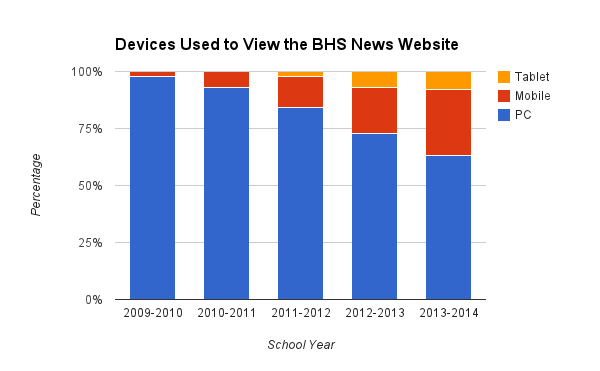
Our audience is shifting to mobile devices
Schools are hardly speed demons when it comes to technology, but eventually we do react. The ever-increasing prevalence of students with smart phones is an indicator every teacher is aware of, but the web statistics show just how much things have shifted in the past few years. That convinced me we had to change our sites to be more mobile-friendly. The challenge was how to accomplish that despite a non-existent budget and my own unfamiliarity with mobile-friendly site design. My next post is about my search for a solution.


 Meador Manor