
July 31, 2014
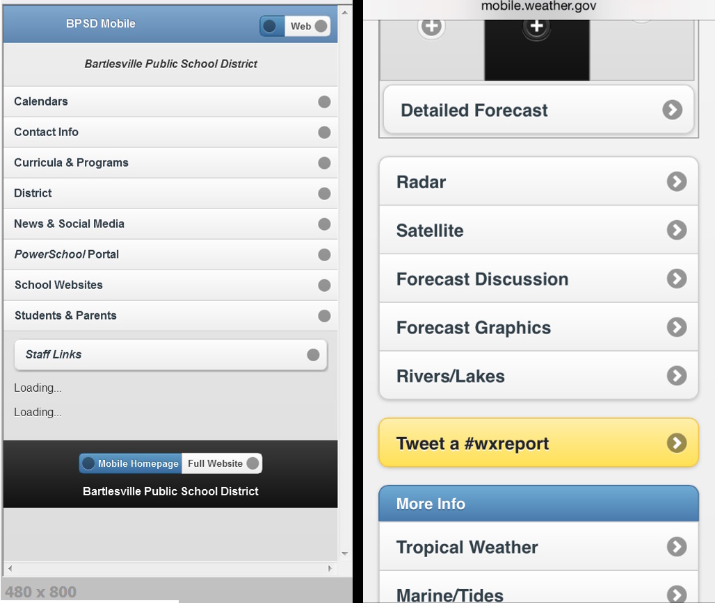
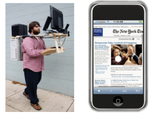
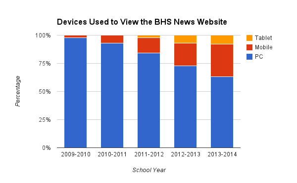
In a previous post I outlined how the visitors to one of our high school websites showed a dramatic shift away from large screen PCs to small-screen mobile devices. That led me to build a new mobile site for the school district. With that ready to go by mid-July, I still had time before the start of the new school year to create another mobile site, one for the high school.
I knew right off that I’d want the high school mobile site to be similar to the district one, so that the modal transition between the two would not be too jarring. I knew this was crucial because, for well over a decade, our district has suffered from multiple-personality-disorder amongst its various websites. I explore that problem in this post.
Our websites’ multiple-personality-disorder
For many years none of the district’s websites were alike. Each had its own layout and structure, navigation system, colors and theme – the whole works. There was no sense of continuity for parents who might have children at multiple school sites, nor for the public accessing different district websites for information. Some sites had very outdated code, leading to malformed pages. Overall it was an idiosyncratic mess.

Until 2014, every website had a distinct design
Those failings were due to the homegrown nature of the various websites. Each was initially built by a volunteer webmaster without any direction from the district. Eventually the site principals at the uppermost grade levels began paying a staff member to act as that site’s webmaster, but the elementary and middle school sites are still run by altruistic staff volunteers. To my knowledge, the district didn’t even earmark any funds for the district-level webmaster until it began paying me a small stipend in August 2012.
Using iframes to create a district border

I now embed school websites in a district-level iframe
In 2013 I took the first step to bring some order to this chaos. I reformed the district site’s link to each individual school site so that the school website displayed in an iframe. That let me keep a simple header navigation bar for the district site at the top to indicate that a viewer was still in the district’s website system.
However, using a basic iframe created a kludge. It forced the school’s website into a restricted window and was annoying, especially for scrolling content in the separate iframe window. So I made sure to include an obvious link just above the iframe that would open the school’s website in a full window, eliminating the frame.
Finally this summer I discovered how to use Javascript to automatically size the iframe to a school’s website if the school website’s files were located on the local server. So for those sites I now customize the iframe’s height and eliminate the frame’s scroll bars. Unfortunately that trick doesn’t work with sites hosted elsewhere (which is what is done for most of our sites now, as you’ll see below). So for them I had to just set an arbitrarily large height for the iframe. This still simplifies the appearance to one window with one set of scroll bars, but it causes many pages to have immense blank footers. I found some of our websites have pages running over 10,000 pixels high, which isn’t good design, but you get what you pay for. I left the option above the iframe to escape it and reload the site in the full window.
UPDATE: At the start of the school year I kept running into link issues with the different school websites when embedded in an iframe. If links did not include target=”_top” they often did not work in some browsers. Since most of the websites are now more unified in their look and feel, as described below, I decided to stop using the iframe banner approach.
A new unified look-and-feel across most of the school websites
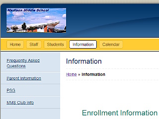
In 2013-2014 the district’s Teacher Specialist for Instructional Technology worked with the various volunteer webmasters for grades PreK-8 to migrate their websites to the MyBigCampus service the district has as part of its Lightspeed internet services agreement. At this point seven of the eight sites have moved to that service, with a consistent use of a header with a photo of the school and a horizontal menu bar. The body of the pages all use a white background. This has considerably unified their look and feel.

Seven of our district websites now use MyBigCampus, providing a more consistent look and feel
The remaining website design outliers are one elementary school, the Will Rogers Complex, the mid-high, and the high school. I presume that MyBigCampus could provide what is needed for the remaining elementary school and the Will Rogers Complex, so hopefully we’ll get those into the design fold. The mid-high site will be eliminated in August 2015 when grades 9-10 become part of the expanded 9-12 high school. That leaves the high school website to consider.
But what about the complex high school website?
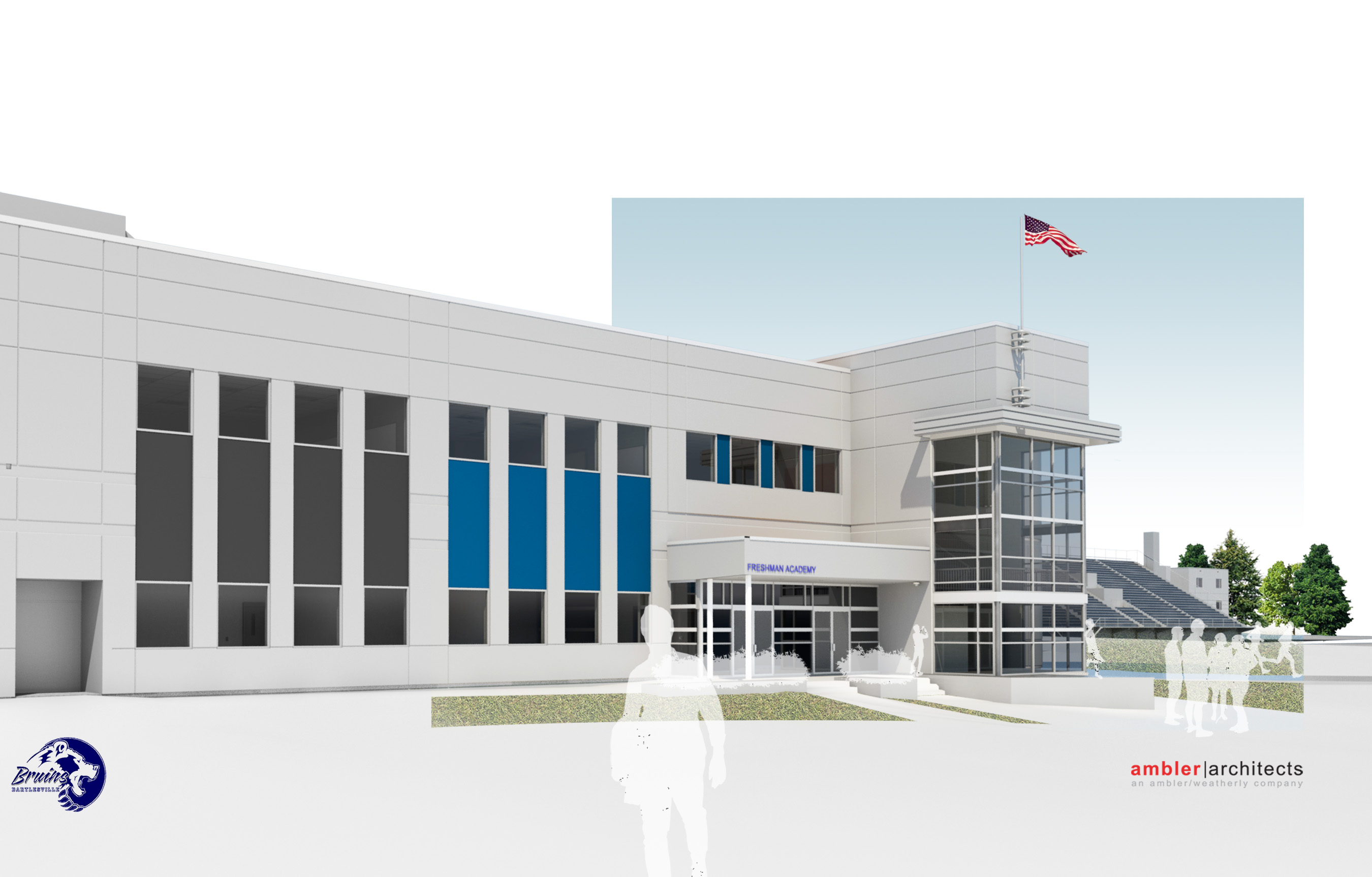
The Freshman Academy poses a website design challenge
The site for grades 11-12 at the high school is already far too complex for the MyBigCampus service, and it will only grow more complex when the school expands to grades 9-12 in August 2015. I will either need to expand the existing design or re-think it entirely.
I’ve put a lot of work into the existing site, so I’d hate to start over from scratch, but the Freshman Academy creates a website issue that needs to be resolved. 9th graders will have most of their classes in a distinct area of the campus. They’ll have their own bell schedule, cafeteria period, administration, counselor, office, and library. So I’m leaning toward them having their own distinct website.
A potential way forward
I’m hoping that the Mid-High’s current webmaster, who is slated to be in the new Freshman Academy, will still be paid to run a new Freshman Academy website. It could link over to the 10-12 website as needed for shared content on news, services, campus information, and the like. We could stick with hand-coded websites or try to move one or both sites to a cloud-based web service for easier development and maintenance. If we went to a cloud service, it would need to have mobile-friendly responsive design.
Thankfully we still have a full year to work all of that out. Meanwhile, in July I had a mobile version of the high school website to build, and I wanted it to work very much like the district’s mobile site, but with just enough differences to orient a visitor as to which mobile site was being displayed. Addressing that problem, and how to deal with the more complex structure of the high school website in the mobile environment, is the focus of the next post.


 Meador Manor