I’ve been hearing about Windows 8, the forthcoming version of Microsoft’s computer operating system, for months on the Windows Weekly netcast I watch regularly on the TWiT network. But I’ve never caught more than a glimpse of it in action. I was dubious of its relegation of the Windows Desktop to second-class status, but I’m also not a big fan of either the Windows Start Menu or the Macintosh’s Dock. Windows 8 features a new Start Page with “live” big rectangular icons of its new “Metro” interface, patterned after the touch interface of Windows Phone. It also features Metro-style apps, which are simplified touch-centric apps similar to what one sees on tablets and smartphones, brought to the home computer.
This is the boldest change to Windows Microsoft has made since Windows 95 and echoes how Apple is steadily integrating features from its own iOS system, which operates the iPhones and iPads, into its desktop OS X operating system for Macintosh computers like my Macbook Air. The two old competitors are still at it: Microsoft will release Windows 8 this year while Apple recently announced the Mountain Lion update to its desktop operating system – both updates show a distinct shift toward touch interfaces and increasing similarities between desktop and mobile platforms. (Although using “desktop” to describe Windows 8 is hardly accurate.)
Having similar mobile and desktop platforms should make transitions easier for casual users, for whom tablets could become a viable replacement for desktops if they solve the keyboard problem. But I’m dubious of the ability of a touch interface to integrate seamlessly with a mouse and keyboard one. However, even as a power user I often find myself wishing certain iPad apps would run on my Windows 7 desktop machine. So there could be some benefits of this “creeping mobility” in the desktop operating systems.
Microsoft released its Consumer Preview version of Windows 8 this week, so I decided I should take it out for a spin. Have to maintain my geek cred, after all. But I strongly advise you to NOT try out the Consumer Preview for yourself unless you are a Power User – it is not for the faint of heart and you could easily wipe out your existing Windows system if you are not careful. Let the geeks scout this new territory. For most of this article I’ll use Win8 to refer to my preview version of Windows 8 and Win7 for my existing Windows 7 system.
Sadly, my initial impressions of Windows 8 are overwhelmingly negative. I greatly dislike its oversimplified and obscure interface and am not at all sold on bringing the limited multi-tasking always-running nature of mobile apps onto the desktop. Furthermore, Microsoft’s implementation of Windows 8 is often counterintuitive, needlessly confusing, and inconsistent.
Creating a virtual machine to install the Windows 8 Consumer Preview
Geek Alert: This section is about the somewhat obscure methodology and settings I used to get the Windows 8 Preview on my system. If you’re not a computer geek, skip to the next section, Brave new world.
I certainly didn’t want to replace my stable Windows 7 system with an experimental Windows 8 one, and my existing one-terabyte RAID 1 mirrored hard drive had too little free space for me to want to partition it into a separately bootable Windows 8 drive. I also wanted to be able to readily switch between Windows 7 and Windows 8. So I decided to create a virtual machine on my existing drive. A nice bonus would be that if I hated Windows 8 I could simply delete the Windows 8 virtual machine and all would be back to normal.
I cleared some space on my crowded hard drive since PC World’s instructions for installing a Virtual Machine to run Windows 8 indicated I might want to allocate more than 20 gigabytes for this experiment. I shifted my old iTunes television shows onto a networked hard drive to gain 30-odd gigabytes back, boosting the free space to almost 100 gigabytes. I then downloaded and installed Oracle’s VirtualBox, using the fairly helpful directions from PC World, choosing to let it use four of my eight gigabytes of RAM, allocating 40 gigabytes to its dynamically allocated drive, and on my own initiative adjusting a setting so that it could simulate 4 processor cores since my i7 920 processor supports hardware virtualization.
Then I downloaded from Microsoft the immense 3.3 gigabyte ISO disc image file for the 64-bit preview version of Windows 8. I installed the new operating system on the virtual machine, entering the product key shown on Microsoft’s web page. I chose to install the 64-bit version since I already run 64-bit Windows 7. It turns out that was probably a mistake: the 32-bit version works better under virtualization.
UPDATE: Later I created another virtual machine using the 32-bit version of Windows 8. It was much snappier.
The installation began and I told it to do a custom install, or what I would call a clean install, and waited for it to trundle through the installation process in its virtual machine window while I worked in Windows 7 in other windows, with the system lagging due to the intensive hard drive usage.
I dismissed various dialog boxes complaining about a 24-bit vs. 32-bit displays and telling me about the mouse and keyboard behaviors. Windows 8 asked me which of several background colors I’d like, had me pick a name for my machine, and then asked me if I’d like to use “Express Settings” and share some location information and the like. I told it that would be fine and then it asked for an email address I would use for a Microsoft account to download apps, share files and photos, and sync settings across machines. I gave it the address of my existing Windows Live account. It asked for my existing password, then for my mobile phone number as a way I could get my password reset later if I forgot it. That’s a first for them, an idea I’ve seen earlier from Google.
Eventually the installation was complete and I was ready to enter the world of Windows 8.
Brave new world
Wow – this sure looks different than the old desktop!
I don’t really care for the huge one-color boxes. They’re clearly meant more for finger taps than mouse clicks. But of course this was a clean install. Maybe it would look better once I personalized various apps. I decided to start with my profile icon, clicking to change my account picture. That immediately forced me to confront how I might transfer files from Win7 to Win8.
Getting files into my virtual machine

The files menu in Windows 8; I decided to use the SkyDrive to get my Windows 7 files into my Windows 8 virtual machine
Since this was a clean install, I had no files to pick from and I found I could not access my Win7 files from the virtual machine. I tried Homegroup, but Win8 and Win7 refused to see each other: leaving either Homegroup still would not get the other machine to see the existing Homegroup. So then I tried Network, typing in the addresses for my shared Win7 hard drive folders. That didn’t work either, possibly because of the quirks of using a virtual machine.
I knew I could log in to my DropBox account via Win8’s Internet Explorer and then download files from there, but I wanted something more elegant.
Perusing the Files entries, I saw a SkyDrive icon at the bottom. SkyDrive is MIcrosoft’s competitor to Dropbox, and it is a boon to have it built into Windows 8. My existing Windows Live account should include web access to SkyDrive, so I decided to try that out.
I logged into Windows Live on my Win7 machine and SkyDrive was right at the top of the menu bar. I uploaded a self-portrait into SkyDrive from there and then I could pick that photo using the SkyDrive link in the Win8 Files menu. Now I was cooking – with propane if not natural gas.
But my Win7 machine was bogging down terribly when I tried to switch back and forth between it and my Win8 virtual machine to work on this blog post. The hard drive was just thrashing about, slowing everything down. I finally learned to shut down iTunes in Win7, which is a terrible resource hog, and other unnecessary programs to give the system some breathing room.

You can pop-up these Charms on the right edge of any screen by placing your cursor on the top right or bottom right corner of the screen or by pressing WINDOWS-C
Mystery meat navigation
The most confusing thing for me at first in Win8 was how each thing you are doing takes over the screen. Why call it Windows when nothing is in a window? This thing acts much more like an iPad, where you need to press the Home button to escape what you are doing. But there was no obvious software Home button on the Win8 screens, just a tiny magnifying glass in one corner of the Start Page.
The overall interface is a prime example of what Vincent Flanders termed mystery meat navigation in his classic Web Pages That Suck: a visually attractive but concurrently inefficient, confusing, or abstruse user interface. Once you leave the Start Page there are few, if any, hints about where to put your mouse to get a response from the underlying operating system. I found myself pounding the Escape key in a vain attempt to exit a screen and return to what in the old days would have been the Windows Desktop, and in Windows 8 should be the Metro Start Screen.
I finally figured out that one way to navigate was to rest the mouse cursor in the lower right corner of the Win8 screen. That caused a “dock” to appear from the right with a few plain icons for Search, Share, Start, Devices, and Settings. I later learned these are called charms, which you can also get a preview of by placing the cursor in the top right corner of the screen and then moving it downward, or you can bring up by pressing the keystroke combination WINDOWS-C.
As I played around in the Metro interface, I found the magnifying glass on the Start Page would give me a shrunken view of the tiles while a right-click allowed you to see reduced-size icons, including many previously hidden ones. The Search icon in the charms sidebar provided an alphabetical listing of apps. So there are a variety of ways to access the equivalent of a Start button on the former desktop.
The problem is that once an app is running there is no obvious way to get the normal Start Page back. You can’t resize or minimize a Metro app. I had to resort to using the Start entry in the charms sidebar to return to the Metro Start Page.
Navigation was difficult enough that I decided to watch the early part of The Windows 8 Era, the 250th Windows Weekly netcast, to gain some insights into the new interface. That taught me that putting the mouse cursor on the top left corner of the screen allows you to preview and select different background programs – a task switcher, which you can also bring up with WINDOWS-Tab. You can also still cycle through active programs with Alt-Tab.
Microsoft should put something visible in the corners of the screen to help users learn and remember how to activate the charms and the task switcher. It took until Windows 7 for Microsoft to put a permanent “Show desktop” spot on the Win7 taskbar, rather than an often missing and easily deleted shortcut icon. And even then it left the Show desktop button unlabeled and transluscent so most users wouldn’t even spot it. Now it has shifted to completely invisible interface buttons. I guess it wants users to feel as clueless as Microsoft appears to be these days.

The default old-fashioned desktop in the Windows 8 Preview is truly hideous and lacks a Start button
The old desktop ain’t what it used to be
The familiar Windows Desktop is still present in Windows 8, complete with a truly hideous default desktop wallpaper of a pathetic drawing of a Betta fish. Ha ha – this is beta software. I didn’t get the joke at first, and it looks like they want the desktop to look so horrible that users will happily flee back into the Metro interface.
Sadly, although the Desktop view still has the usual taskbar, it has no Start button! That’s pretty nasty. How in the world are you supposed to get to your stuff? I tried the Windows key on the keyboard (the one with the little Windows flag icon on it which most people never use), but it just switched back and forth between the Metro interface Start screen and the hideous default desktop.
UPDATE: It turns out that if you carefully aim your mouse at the lower left-hand corner the Task Switcher will appear with a link to the Metro Start Page. But that’s hardly a Start button, allowing you to easily pull up various programs from the Desktop.
If Microsoft expects users to not be terribly confused, it needs to put a visible Start button on that old desktop. Yes, this would make it possible for folks to completely avoid the Metro interface, but why even offer the desktop interface at all if you aren’t going to fully enable it? No doubt they have to provide one for compatibility with the zillions of existing Windows programs, but they’re just going to confuse users when the new Desktop appears without the Start button. I’d even take a visible Start button that does nothing more than return one to the Metro Start Page or, even better, one takes you to Metro’s App Search. It is no surprise that users are already clamoring for utilities like ViStart to bring back the Start button.
Using Metro
I jumped back to the Metro Start Page and started tapping on the various tiles so that I could personalize them and see what their “live” views would do. I also wanted to rearrange them, finding that it was as simple as holding down your click on a tile until it shrank a bit and you could move it about. That is a clear counterpart to how iOS jiggles icons you want to move or delete. I actually prefer Microsoft’s Metro to Apple’s iOS in this regard – all of those jiggling icons on an iPad or iPhone screen are Just Plain Annoying.
I also found you can right-click a Metro app tile to configure its size and to unpin it from the Start Page.

The Weather app is quite nice, but why can't I click and drag to see the additional information off to the right of the screen, rather than being forced to use the bottom scroll bar?
Weather
First up was the new Weather app. It asked for permission to locate me and quickly brought up the Bartlesville weather. I could click on the daily weather info for more details, including different forecasts from weatherunderground and weather.com. I could use the minimalist scrollbar along the bottom edge of the screen to slide the Metro view sideways for hourly info, maps, and more. That was okay, but the Metro interface would clearly be much faster and easier to use with a touchscreen. I felt I should be able to click and drag to slide the screen over, but the scrollbar was the only obvious way to reveal the additional information. I get that different Metro apps would use click and drag for different functions, but why not have the Weather app interpret a click and drag to mean to scroll the screen? Is that not obvious?
UDPATE: Paul Thurrott reports there is a “push scrolling” feature where you can glide the cursor against the edge of the screen to make it scroll. That doesn’t work in my installed versions, perhaps due to the windowing of the virtual machine? He also reports the arrow keys will scroll the screen, which did work for me, but in my installation his tip to use Page Up and Page Down for a quick scroll did not work. However, the scroll wheel on the mouse did work to scroll the screen. I still think click and drag would make a lot of sense to mouse users.

When you are composing a message, the only icons are for Send and Close. You have to know to right-click the mouse to get to the application settings.
When I clicked on Mail, it defaulted to asking me for an Exchange account’s info. I fed it my school’s Exchange info, but it then complained about me needing to enable various security settings. Even after agreeing to them it could not interface with the school’s Exchange server. That would be far too useful, wouldn’t it? I’d suspect that our Exchange server is not set up to support this sort of convenience, but if it someday would interface properly with Windows 8 that would be a godsend over having to use the WebMail interface.
I tried to compose a message and again encountered what I will call the I.I.I.: the Insanely Invisible Interface. The only visible icons were for Send and Close. I wanted to delete the nonfunctional Exchange account, and had to figure out for myself that a right-click on the mouse would bring up more options. If the point is to make the interface simpler for new users, why in the world would you expect them to know to right-click their mouse? A visible icon for more settings is too much for them? I just don’t get how this mystery meat navigation ever survived a focus group of new or experienced users. Did they even run any focus groups?
Once I knew the right-click trick I was quickly able to delete the Exchange account and install my Google account instead.
UPDATE: Paul Thurrott reveals that the keyboard shortcut for this type of thing, called an App Bar, is WINDOWS-Z. Of course. 😕

Click and drag moves the maps around like it should, but you can't use click and drag nor arrow keys to scroll through the direction panes...only the scrollbar works. How stupid.
Maps
Nice app, and click and drag does what it should: move the map around. Why the Weather app can’t figure out that click and drag should scroll the weather info remains a mystery. But when you get directions in Maps, neither click and drag nor the arrow keys will advance the direction panes…instead you’re back to using the scrollbar. Microsoft will seemingly never pose a challenge to Apple when it comes to designing user interfaces.
Killing off undead Metro apps
I exited back to the Start Page…but that isn’t true. I jumped back to the Start Page – I never really exited any of the Metro apps. That’s another “feature” of Metro: the Undead. That’s my nickname for the new syndrome in mobile operating systems, and now in Windows 8, for an application to lack any sort of close button but to instead get shoved into the background forever, where it supposedly is suspended and not using resources.
I know from experience that is often a lie, at least on Apple’s iOS. Some apps still run background processes when “suspended”, and for good reason. A GPS app needs to stay active to keep track of things, some audio apps need to be able to keep playing while you muck around in another app, and so forth. But that means I’m never really sure an app in the background isn’t still wasting resources and battery life. So all too often I find myself tediously killing off iPhone and iPad background apps in the iOS task switcher, which I think of as the tedious trick to truly terminating the undead.
Now I get to play the same game in Win8. There is no apparent way to shut down a Metro app. It just keeps running in the background, filling up slots in the task switcher. Some online sources said you could only kill off background Metro apps by using the Win8 Task Manager, but a quick experiment of mine showed you can right-click on an app in the left-hand-side Task Switcher view and close it. That’s just great – one of my least favorite aspects of mobile operating systems brought to the desktop for my annoyance. I was feeling worse and worse about Win8.
UPDATE: Paul Thurrott reports and my own test confirmed that ALT-F4 also will kill a Metro app.

The calendar app was already populated, presumably because I had set up my Google account in the Mail app. But I couldn't figure out how to access its settings.
Calendar
I opened the Calendar and was surprised to find it already populated with a number of my appointments. Did it pick those up when I was trying to configure my Exchange mail account? But I thought I killed that off. Perhaps it is picking them up instead from the Google account I set up in the Mail app? I get that this sort of behind-the-scenes work makes life easier for newbies, but for power users it is frustrating not to know what data sources an app is utilizing.
One would think there is some way to configure what source the Calendar app is accessing, but my putzing around with clicks and right clicks and various keystrokes availeth nought. More I.I.I.?
Then I tried the old reliable F1 key, which has meant HELP! for ages. Nothing. I found out F1 worked some places, but not all by any means.

There are already a number of predefined ways to add to your contacts, which is called the People app.
People (Contacts)
I also tried People and found it was a contacts list or address book. It too was already populated, but at least it had obvious buttons to allow me grab contact information from Facebook, Twitter, and so forth. That’s more like it. Maybe they’ll have this sort of thing in Calendar when the app is finalized…but maybe not.
Finance
I deleted the default stock tickers in the Finance app and added a few of very minor interest to me. Yawn.
Solitaire
A foolish consistency is the hobgoblin of little minds, adored by little statesmen and philosophers and divines.

Solitaire was sluggish and I was puzzled that it took a double click to get more cards dealt in the 64-bit version, but the 32-bit one
I thought of that Emerson quotation when I tried to get another deal in the requisite Solitaire app. Clicking on the blue card did nothing; I had to double-click instead. I didn’t recall double-clicking anywhere else in Win8 up until then. Harumph.
UPDATE: For some reason only a single click was needed to deal more cards in the 32-bit version. How strange.
Solitaire was also very sluggish in moving and updating cards. That might be an artifact of my virtual machine, but for such a simple app to lag so noticeably is a concern. Perhaps I should start over with the 32-bit version of Win8 on my virtual machine?
UPDATE: The 32-bit version was indeed snappier, although still had some lag.

Double-clicking a file's icon in Reader did not open it. I had to click the Open button...another design flaw.
Reader
This is a PDF reader, I guess. I uploaded a couple of PDF files to SkyDrive and was unamused to find that double-clicking the icon for a file did not open it. Instead I had to click to select a file and then separately click a dedicated “Open” button. That cinched it – Microsoft’s own app developers are not following consistent interface rules. Pathetic.
How live are those tiles now?
I worked my way through the remaining default apps, deleting the Xbox ones since I am no gamer and have no Xbox Live account. That meant Videos and Music didn’t do much beside serve up ads and struggle to connect to my non-existent Xbox Live account.
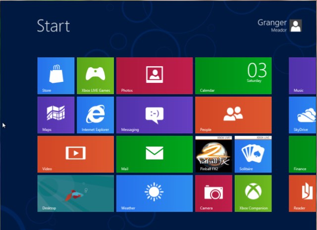
Here’s what the Start Page looked like after my initial foray through the Metro apps:
I was a bit surprised more of the icons hadn’t shown signs of life. But Desktop showed the better wallpaper I had slapped over that hideous Betta, weather showed current conditions and forecast high/low, Mail showed the most recent flattering message, Calendar showed today’s appointments, and Finance showed the stock market indices. I was surprised Photos didn’t show the currently selected photos in that viewer, Internet Explorer didn’t show a thumbnail of the currently displayed page, and Maps didn’t show a map thumbnail either. Maybe you wouldn’t always want such thumbnails to be visible? Maybe you can customize the tiles to show them? I’d have to experiment more later on.
Is Windows 8 the next Vista?
I think of early versions of Windows as being somewhat like the early Star Trek movies:
| Star Trek Films | Quality | Windows Versions |
| I: The Motion Picture | Not bad, but had significant shortcomings | Windows 3.31 for Workgroups |
| II: The Wrath of Khan | Awesome | Windows 95 |
| III: The Search for Spock | Yawn | Windows 98 |
| IV: The Voyage Home | Very popular | Windows XP |
| V: The Final Frontier | Simply dreadful | Windows Me |
It isn’t a perfect analogy since I’m ignoring Windows 2000, which was very stable compared to Windows 98. But a fresh pattern of alternating good and bad may have begun with Windows Vista, which deserved its horrible reputation, while I quite like Windows 7. Windows 8 strikes me as another misstep.
I applaud the idea of live tiles and the availability, if not dominance, of simple apps. But I’d much rather they become part of the standard Windows Desktop rather than having the Metro interface dominate with the Desktop left crippled and hidden away as yet another Metro app. And many of the Metro apps and the overall Windows 8 interface suffer from invisible navigation tools and inconsistent interface design.
A good polish on the Metro apps, providing visible icons for settings and options, could help immensely, as would visible icons for the right-side charms and left-side task switcher. But I’m left wondering how a Metro app would ever provide me with the wonderful functionality I now enjoy in Windows 7 of having two windows open, speedily tiled with each other by simply dragging a window to the left or right side of the screen.

I'm a big fan of how easy it is to tile two application windows in Windows 7; can Metro apps ever do this?
And I love having all of my favorite apps always available in the always-visible task bar at the bottom of the screen. Metro’s full-screen interface feels very limiting compared to the power of the Windows 7 interface, which reflects 14 years of interface refinements since Windows 95. At least Windows 8 preserves the Desktop environment, although the lack of a Start button grates.
I especially dislike the modal nature of Windows 8 – you are consciously switching modes when you leave Metro for the old Desktop. I suspect new users will be confused and annoyed by the Metro overlay and businesses will be in a world of hurt, their users often left adrift, unsure of what in the world has happened and why they can’t escape from whatever screen they have landed on. No doubt most businesses will ignore Windows 8 on the desktop just as they did Windows Vista, hoping for a better bargain with Windows 9.
UPDATE: I must agree with Paul Thurrott and former student Zach Harbort that Windows 8 will make its biggest inroads in the tablet market. I’m certain that Its touch interface is far superior to the touch features of Windows 7, and Microsoft needs an OS presence in the burgeoning world of tablets to compete with Apple’s iOS and Google’s Android. But Mary Jo Foley is right that businesses will be very leery about putting Windows 8 on desktop machines, even if policies can jump users into the Desktop rather than the Metro interface.
I haven’t given up on Windows 8 and will educate myself further on its interface and features. But I’ve completely skipped past versions of Windows and benefited from that negligence: I’ll never regret not using Windows Me or Vista. Windows 8 may suffer a similar fate for desktop computing unless it undergoes significant change, which appears unlikely at this late stage.


