Summer Solstice 2025, Part 1: OKC

We barely left town over the 2024-2025 Winter Break, and while we had planned to get away to Oklahoma City during Spring Break, a dust storm led us to just enjoy lunch at one of the two surviving El Chicos in Tulsa and then return to Bartlesville. So when making reservations on April Fools’ Day for my annual two-week June vacation, I decided we should try to hit OKC again, as we were way overdue for burgers at Johnnie’s Charcoal Broiler.

I knew that we would be anxious to escape the summer heat and humidity by mid-June, and that Wendy did not wish to fly. That meant driving to either northern New Mexico or western Colorado, where high altitudes could provide some climatological relief.

Both April and June turned out to be unusually wet in Bartlesville, so I was glad I ended up choosing our typical summer vacation spot of Santa Fe, New Mexico. Santa Fe’s altitude provides a welcome summertime escape from Bartlesville’s humid subtropical weather (Cfa). For those not keeping track, I had stayed in Santa Fe ten times over the previous fifteen years, with Wendy joining me for the last seven of those trips.

This trip began with a drive down the Turner Turnpike. For decades, I made that pilgrimage multiple times each year to see my parents in Oklahoma City, but in 2022 my father passed and my mother moved to Bartlesville. So my visits to my hometown increased drastically in early 2022 but then were abruptly curtailed.

Back in 2017-2018, the turnpike was widened to three lanes between Sapulpa and Bristow. Thankfully, the Access Oklahoma project will widen the remaining 68 miles of the turnpike. The project might conclude in 2036 and is projected to cost $2.5 billion. I welcome it, having endured decades of ever-increasing truck traffic over the Turner’s route through the hilly crosstimbers. The road is currently being widened southwest of Bristow, and a new bridge is going up at Wellston.

Johnnie Haynes
Johnnie Haynes and sons making his hickory sauce

One way I dealt with the severed connection to my hometown was a plethora of posts in 2022 and 2023 about Windsor Hills, Putnam City, and Tex-Mex food, pizza, and burgers I enjoyed in my youth. After our failed attempt to visit OKC in the spring, I ordered some of Johnnie’s hickory sauce for Wendy, and it was a fait accompli that we would return to Britton Road so Wendy could order a #1 with Johnnie’s sauce while I opted for my usual burger with just cheese and mayonnaise. We were both loyal to the late Johnnie Haynes’ preference, ordering our burgers with shredded, not sliced, cheese.

The former Myriad is being demolished

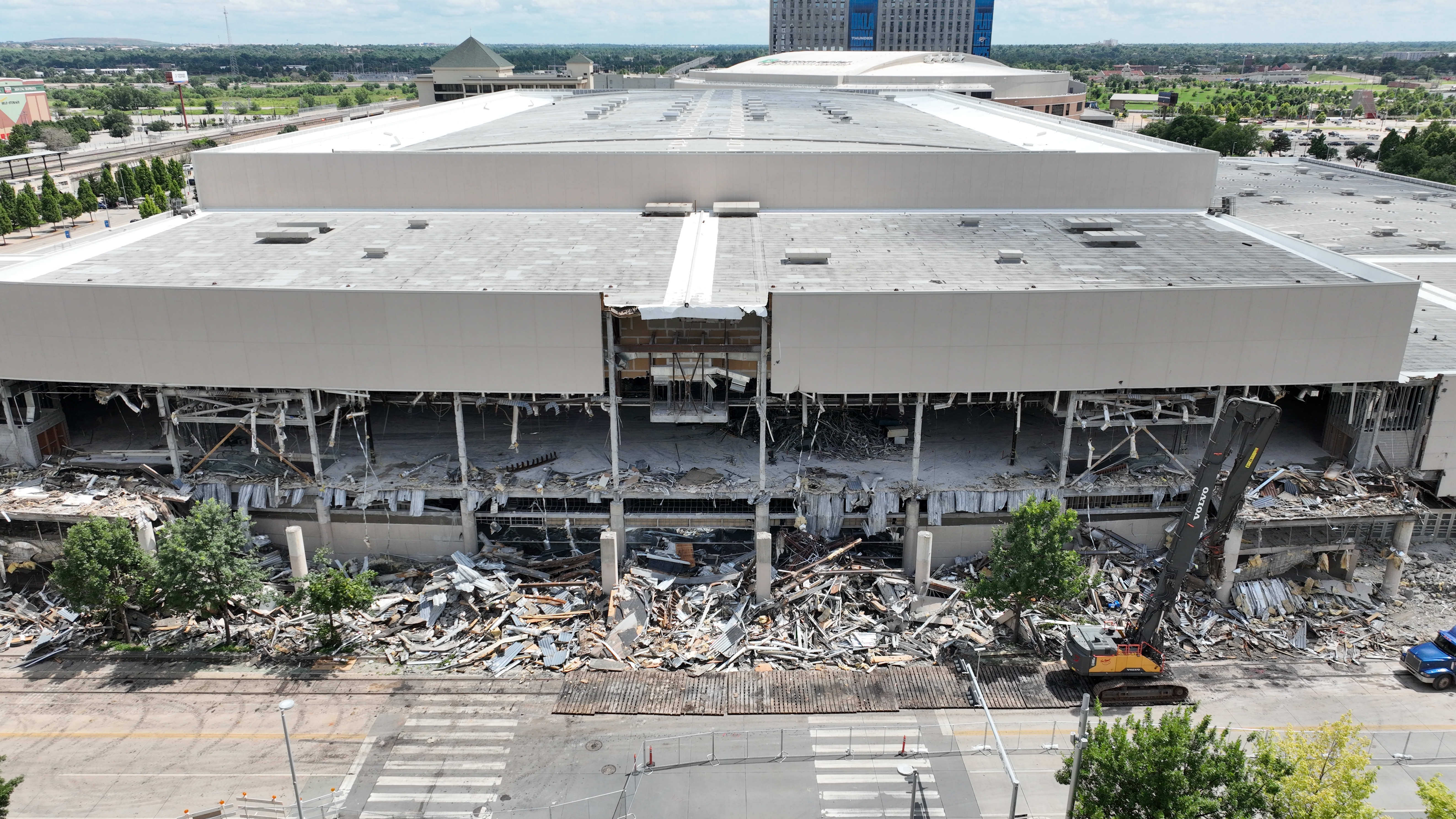
Although we ventured downtown for its art museums, I resisted going by the former Allen Morgan Street Memorial Myriad Convention Center, which is being demolished and was featured in my January 2025 post on OKC Urban Renewal. I preferred not to witness the destruction of the place where I attended a couple of proms, graduated from high school, and participated in various conferences over the decades.

We exited Interstate 40 to follow Oklahoma City Boulevard westward, which in my youth was the original route of the elevated crosstown expressway. We caught passing glimpses of the large new Omni hotel, the new convention center, and Scissortail Park before turning north on Walker Avenue and then east on Colcord to park in the Arts Garage by City Hall.

Oklahoma City Museum of Art

While I was growing up, the city’s art museum was in a building on the state fairgrounds and concentrated on 20th-century American painting and photography. There was a second museum, the Oklahoma Museum of Conservative Art, that exhibited European representational works, but it was up in snooty Nichols Hills, and I don’t recall ever visiting it.

The current and vastly improved museum opened in 2002, and it has always featured glass creations of Dale Chihuly. We took a quick stroll through that gallery but focused our attentions elsewhere.

There was an exhibit of Ansel Adams’ photography, but that has never appealed to Wendy, and I’ve seen enough exhibits of his work, including a large show at Gilcrease in 2008, to satisfy my interest. We paid far more attention to a Postwar Abstraction exhibit.

Wendy liked the color field Willem de Looper created without brushes by flooding his canvas with layer after layer of thinned acrylic paint. It reminded me of some of the paint pours she created before shifting to her current interest in rerooting the hair of Barbie dolls. She accessorizes and donates many of them to children at one of our underprivileged schools.

Untitled by Willem de Looper

We both liked Cool Staccato, a large color bar painting by Gene Davis, and I convinced Wendy to pose in front of it.

Wendy with Cool Staccato by Gene Davis
Wendy in front of Cool Staccato by Gene Davis

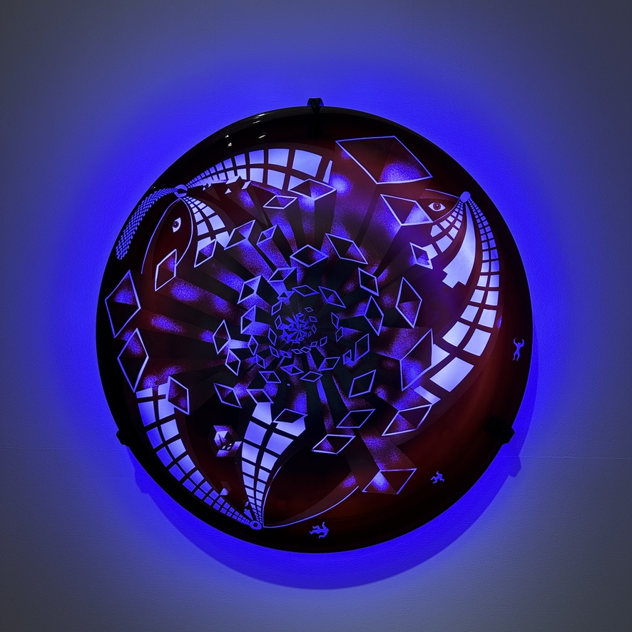
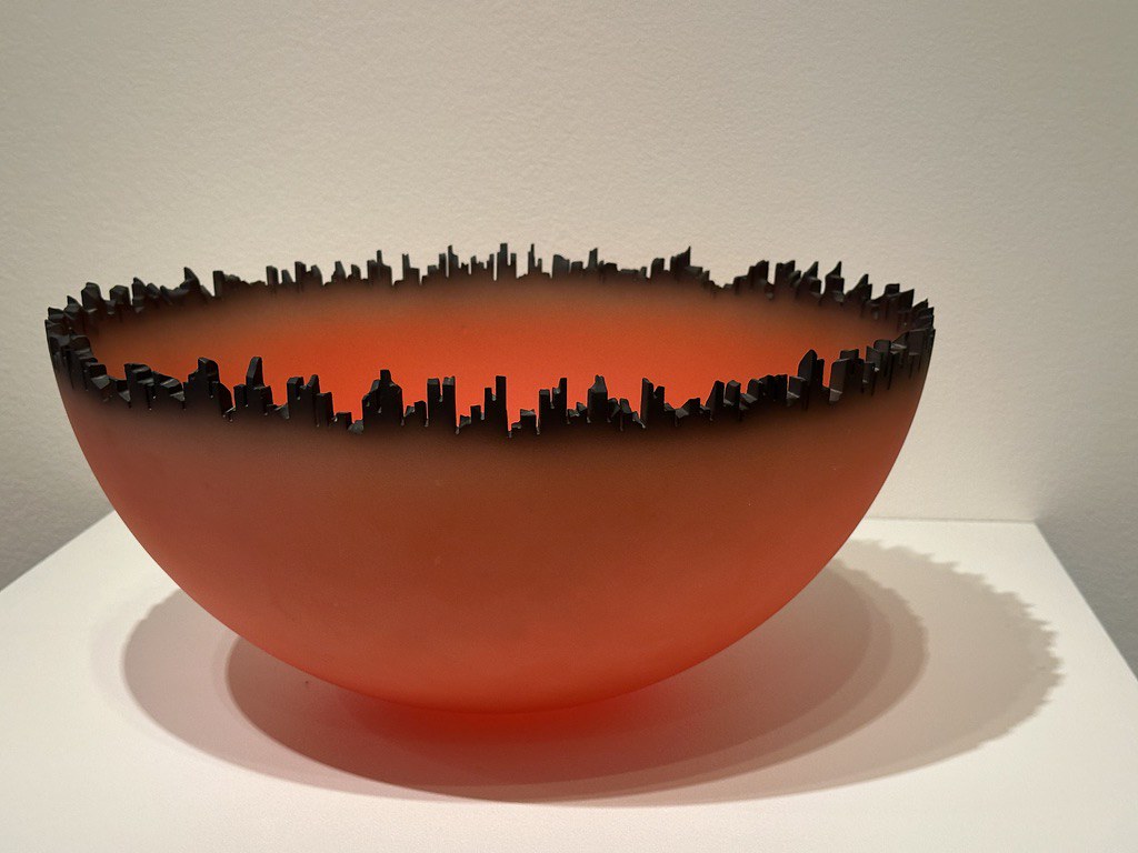
A couple of glass pieces, not by Chihuly, caught my eye: Steve Tobin’s Neon Wall Piece and Cityscape by Jay Musler. The latter was a sphere of blown Pyrex glass that had been cut in half with a notched skyline created around the rim by high-pressure sandblasting, followed by airbrushing with oil paint.

I like anything by Thomas Moran, and Oklahoma City has long had one of his Grand Canal paintings.

Grand Canal, Venice by Thomas Moran

I also like View of the Basin of San Marco by Ippolito for its lovely sky.

View of the Bacino di San Marco, Venice by Ippolito Caffi
View of the Bacino di San Marco, Venice by Ippolito
Port of Cassis (Marseille) by Charles Camoin

Wendy liked Port of Cassis (Marseille) by Charles Camoin.

Oklahoma Contemporary

We next drove over to the west side of the railroad tracks at 12th Street to visit the Oklahoma Contemporary Arts Center. It opened in 2020, and we had never visited it before.

We noticed a t-shirt with Folding Light by Matt Goad, and we liked that enough for me to order a print for Wendy since the only print at the museum had been damaged.

Folding Light by Matt Goad
Folding Light by Matt Goad, an impression of the Oklahoma Contemporary museum
Edgar Heap of Birds

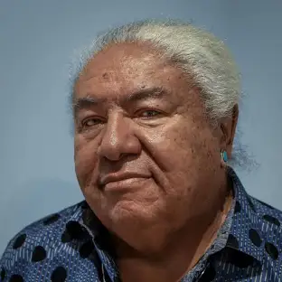
The entire museum was being used to display works by Hock E Aye Vi Edgar Heap of Birds, a multi-disciplinary artist who is Southern Cheyenne. He was born in Wichita, Kansas.

His works include public art messages, acrylic paintings, prints, and monumental porcelain enamel on steel outdoor sculpture.

Several of the installations were groupings of monoprints with brief lines of text. A red grouping spoke of the troubled history of the First Peoples and European conquests. One of the panels, Do Not Dance for Pay, is a repeated element in his artwork. It is a critique of the expectation that indigenous artists should primarily create art for commercial purposes or to entertain non-indigenous audiences, rather than expressing their own culture and addressing social and political issues.

Work by Hock E Aye Vi Edgar Heap of Birds
Edgar Heap of Birds working on a monoprint

A set of typeset posters also spoke to exploitation of Indian culture.

Work by Hock E Aye Vi Edgar Heap of Birds

A large brown display spoke to immigration and border policies.

Work by Hock E Aye Vi Edgar Heap of Birds

A set of blue prints had a mix of messages.

Work by Hock E Aye Vi Edgar Heap of Birds

The museum included a print of Prairie Fire by Francis Blackbear Bosin, who was both a teacher and a major influence on Heap of Birds’ artistic practice with his Flatstyle painting.

Prairie Fire by Francis Blackbear Bosin

There was a print from the Highway 77 Series by Kiona Wooten Millirons, with her naked form layered in among rocks. An Oklahoma City artist, her more recent works have explored her journey through the aftermath of her sister’s death and the trial of her sister’s murderer.

Highway 77 Series by Kiona Wooten Millirons

We enjoyed exploring the studio spaces along a hallway in the museum, which were in use for summer art camp. Happily the creators of the bold linear designs along the corridor walls were credited.

Oklahoma Contemporary hallway art

Wendy and I make a point of visiting both the Nelson Atkins Museum of Art and the Kemper Museum of Contemporary Art whenever we visit Kansas City, and the New Mexico Museum of Art and the IAIA Museum of Contemporary Native Arts when we stay in Santa Fe. Now we can similarly visit the Oklahoma City Museum of Art and the Oklahoma Contemporary whenever we visit OKC. Our NARM cards from our Woolaroc memberships grant us free access to all of those institutions. (They also work at Philbrook and Gilcrease in Tulsa, but Gilcrease won’t re-open in its new facility until the fall of 2026.)

Hotel

Wendy and I used to stay at the DoubleTree by Hilton north of the airport, but later shifted to an Embassy Suites off Northwest Expressway. I decided to try the older Embassy Suites north of the airport on this trip; I remember when it was constructed in 1983.

The hotel was okay, having been renovated in 2012, but it was showing its age. I think we might shift back to the one on Northwest Expressway in the future. We didn’t bother with the hotel breakfast, instead driving to the Jimmy’s Egg on Highway 66 just west of Portland Avenue, which was one of my father’s three favorite breakfast places along the Mother Road near my parents’ home from 1978 to 2022. The others were a Dunkin’ Donuts east of Meridian Avenue and Jim’s Diner at Council Road.

Mall Memories

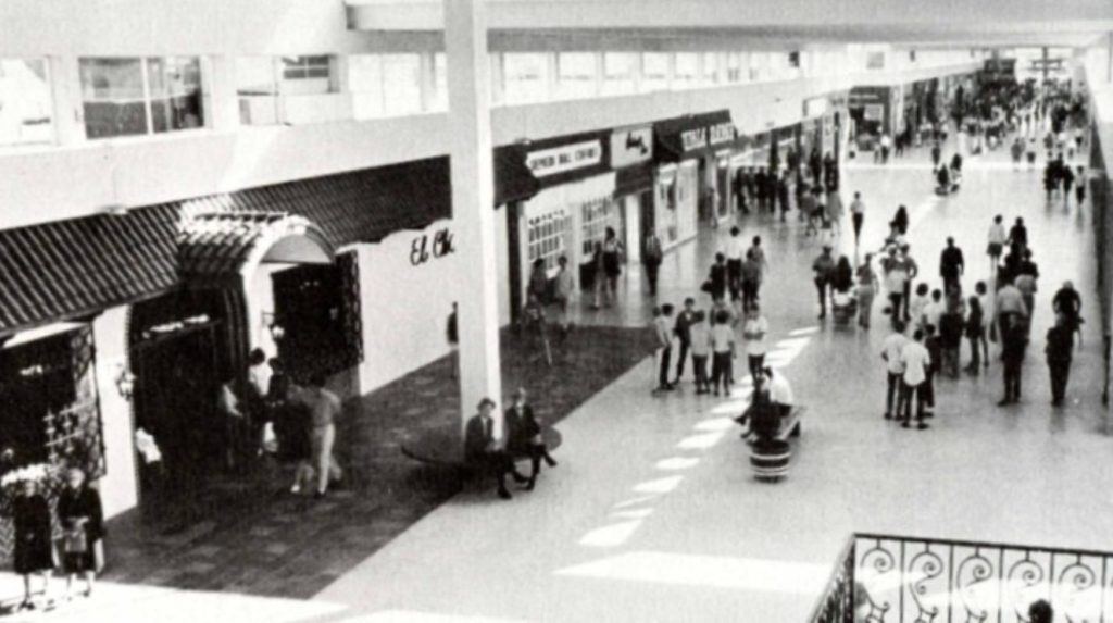
The only other stop we made in OKC was an evening visit to Penn Square Mall. It was built in 1960 as open-air shops in various styles. I preferred the enclosed Shepherd Mall, especially in summer and winter, which was the city’s first enclosed mall in 1964. Penn Square was enclosed in 1982, enabling it to outlast Shepherd, which lost its last anchor store in 2003 and became an office complex.

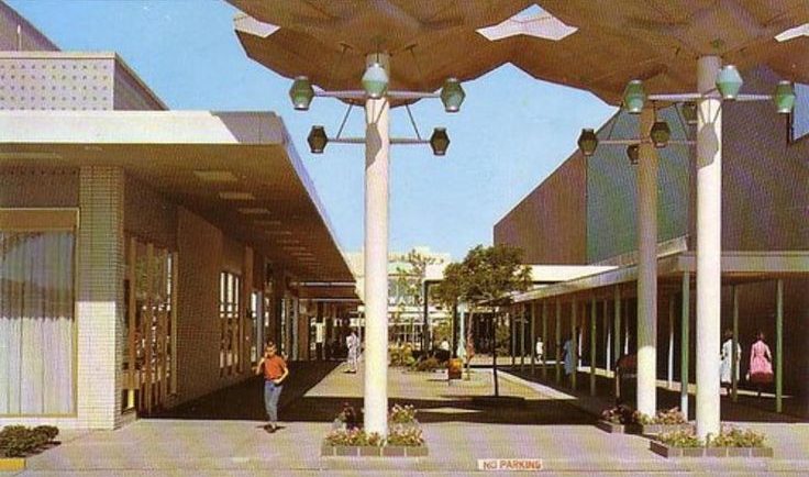
OKC once had several thriving malls: Shepherd from 1964 to the 2000s, Penn Square since its enclosure in 1982, Crossroads from 1974 to the 2000s, and Quail Springs since it opened in 1980. There was also Northpark since 1972, although in my youth I found it dark and dreary, and French Market Mall, which we seldom visited although I did get up early once for a Black Friday opening sale at an Office Depot there, in its unenclosed section, to purchase my first flatscreen monitor.

My impression is that today the only malls in OKC that still have anchor stores are Penn Square and Quail Springs. It appears that Shoppes at Northpark is still populated, but lacks the classic department store anchors to draw in customers. Tulsa has seen a similar diminishment, with Woodland Hills still going strong while Eastland, Promenade, Southroads, and the Kensington Galleria malls are kaput.

It was nice to walk around a J.C. Penney’s and a Macy’s again and stride through a mall with plenty of customers instead of walking through an eerie liminal space such as the zombie Arrowhead Mall in Muskogee.

Bartlesville’s Washington Park Mall was built by Sears in 1984, and is about the same size as the Muskogee mall. It lost its anchor Sears and J.C. Penney stores years ago. Dillard’s owns its building at that mall’s eastern end, but it has been converted into a Dillard’s Clearance Center. Here is a look at Bartlesville’s mall in 2025, which is trying to revive with small local businesses:

The next morning, after our breakfast at Jimmy’s Egg, we rolled westward along Interstate 40 to Amarillo, but with a slight detour to Erick. That means the next post will concentrate not on visual art, but on music.

Flickr Photo Album

Summer Solstice 2025, Part 2 >

Posted in art, history, photos, travel, video | Leave a comment

Immersed in Apples

Granger Meador June 2025

Windows 10 support ends in mid-October 2025, and back in April 2024 I shifted from using a Windows home computer to an Apple Mac Mini. I didn’t make that decision lightly, since I’d used versions of Microsoft Windows for 40 years. I still use it at work, where we have migrated our desktop computers to Windows 11, but that will end upon my retirement in 2026.

Adjusting to my Mac Mini

I’ve now relied on a Mac Mini at home for over a year, and I’m content with that shift. It helped that I’ve used an iPhone since 2008 and iPads since they debuted in 2010, and I’ve worn an Apple Watch since 2018. Their various integrations with MacOS are handy. I can snap a photograph with the great camera on my iPhone, tweak its appearance using the larger touchscreen of my iPad, and then, if I want to use it in a blog post or compose a photo album on Facebook, it is already at hand in the Photos app on my Mac Mini.

My Apple ecosystem consists of a Mac Mini, iPad, iPhone, Watch, and TV

I can also quickly send items between those devices using AirDrop, and Continuity allows the devices to interact in various ways, including unlocking my Mac for me if I’m wearing the Watch. I especially like having access to Messages on the Mac for quick multifactor authentications.

I’ve also had four different Apple TV set-top boxes since 2007, and on weekday mornings I use my iPad to access aerobics videos stored on an external drive hooked up to my Mac Mini which I AirPlay to my old Apple TV, allowing me to easily work out to their playback on our big television screen.

Given that so much of what I do now involves online services, the most significant adjustment for me in my transition from Windows to the Mac has been in graphics management and editing. For 20 years I used ThumbsPlus Pro in Windows to view, organize, and perform basic adjustments to my graphics, firing up Photoshop Elements when I needed a healing tool or to perform a dodge or burn. However, Phillip Crews, who created ThumbsPlus, passed away in May 2024 right after I shifted to using a Mac at home. So it was timely for me to find an alternative.

I tried various MacOS graphics programs back in April 2024, and I’ve settled on using the Preview app on the Mac to view items and do a few basic edits, exporting items to the Photos app when I need to do finer work, including adjusting shadows, highlights, etc. and using its Clean Up and Retouch tools.

However, since I do most of the retouching of my own photos with my basic iPad, I don’t have access to retouch tools in its Photos app since Apple chose to only make them available on higher-end iPads. So I sometimes import photos into apps like Snapseed for retouches, and I use PhotoScanner Pro if I want to bring some life back to faded vintage photos.

I use Google Drawings, which I think of as Google Draw, when I want to assemble a collage or do more sophisticated annotations, since the Markup tools in Photos will do in a pinch but are generally cumbersome and imprecise. For decades I relied on DrawPerfect and its Corel Presentations replacement on Windows desktops, but I switched to Google’s free online tool years ago.

My Mac is crucial for my project of researching and sharing the history of our downtown buildings, which I am creating in Google Slides. I am continually referring to scans of old city business directories, vintage fire insurance maps, and other PDFs while incorporating online photos and my own shots taken on my iPhone 14 Pro while walking around a block on weekend mornings in the summer.

Mobile Computing

I’ve shared before how I’ve never been fond of laptop computers, despite owning five of them since 1997 and using Chromebooks since I started leading their implementation for students in our school district back in 2016. I don’t plan on replacing my Pixelbook when it reaches its end-of-life in August 2027. Instead, I hope to just use my iPad with its Magic Keyboard when I’m travelling.

The practicality of that approach will be bolstered as Apple brings more traditional interface features to my iPad this fall with iPadOS 26. They plan to implement overlapping resizable windows, including the familiar controls to close and minimize them.

Overlapping windows in iPadOS 26

I have no use for Split View, let alone Slide Over. Their controls and gestures never became familiar to me, so I’m hoping that the new windowing system will draw more upon my decades of experience with desktop windows, making multitasking more feasible on the iPad.

Given the limited screen size, I might also make use of the addition of Exposé to the iPad, where your various active applications are selectable in a tiled representation.

Exposé might be useful on the iPad; I don’t use it much on my Mac

I’m often accidentally triggering Mission Control on my Mac, which I made a hot corner shortcut, so I just hope that they don’t make Exposé too easy to trigger on the iPad, and I’m wondering how it will determine which apps are “active” given that we’ve been trained not to “close” apps on the iPad.

They will also be adding app menu bars, which might reduce mystery meat navigation and expose more app features. However, one aspect of MacOS that I have had difficulty acclimatizing to is that its menu bar is always at the top of the screen, rather than at the top of a window as in Microsoft’s operating system, and on the iPad, you’ll have to either swipe down from the top of screen or move the cursor to the top to reveal it.

A menu bar might be handy in iPadOS 26; we shall see

I was worried that Apple might shift MacOS to be more like its mobile operating systems, so it is a relief to see them shifting the other way, adding MacOS features to iPadOS. That could help me stay within their ecosystem for all of my computing hardware, at least for awhile.

Posted in Mac, technology | Leave a comment

Darkness at Noon

Long ago, early in my years of teaching high school physics, I came across an old paperback book from 1961, The Watershed, with a cover that showed Johannes Kepler and an illustration of his first and second laws of planetary motion.

I snapped up the biography, enjoying it immensely. I used it to flesh out my lectures on our evolving understanding of the cosmos when we studied universal gravitation. A few years later, revisiting this entry in The Science Study Series, I noticed that it was actually an excerpt of a larger work of 1959, The Sleepwalkers.

I sought that out, devouring the thick tome, which was so interesting that it, along with Timothy Ferris’s Coming of Age in the Milky Way, led to me devoting a week of my course each year to the progress from Eudoxus in 300 BCE to Einstein in the early 1900s CE.

Arthur Koestler

The author of The Sleepwalkers, Arthur Koestler, is best known for his book Darkness at Noon. From my introduction, you might guess it is about astronomical eclipses, but you would be wrong.

Koestler led a most interesting life. He was born in Budapest in 1905, studied engineering for awhile in Vienna, but when his father’s business failed, Arthur left for Palestine. He edited a German and Arabian weekly newspaper in Cairo, and became a journalist who traveled extensively.

In the early 1930s, he moved to the Soviet Union for a few years and was an active communist from 1931 to 1938. He participated in anti-fascist movements, and as a war correspondent in Spain during its Civil War, he was imprisoned, sentenced to death, but then released in a prisoner exchange.

Back in France, he struggled to make a living and agreed to write a sex encyclopedia, but his crooked cousin was exploiting him and Koestler only received a flat payment of 60 pounds for a work that sold in the tens of thousands.

In 1938, he resigned from the Communist Party, disillusioned by Stalin’s show trials of 1936 to 1938. Koestler was electrified by the confessions of Nikolai Bukharin, a popular and highly intellectual Bolshevik leader he had met in Russia. How could Bukharin and other defendents have been manipulated to confess to crimes they had clearly not committed? Why had the victims of Stalin’s coup de théâtre played their parts so willingly and gone so obediently to their deaths?

Daphne Hardy

That led him to write an anti-communist novel while living in Paris with 21-year-old British sculptor Daphne Hardy. She translated his manuscript from German into English and smuggled it out of France when they fled ahead of the Nazi occupation of Paris. She fled to London, while Koestler joined the French Foreign Legion to hide his identity. For decades, her English translation was the only manuscript of the book known to have survived.

Koestler deserted the legion in North Africa, heard a false report that Hardy had died when her ship to Britain had been sunk, and tried unsuccessfully to commit suicide. He finally turned up in Britain without an entry permit and was imprisoned. He was still in prison when Hardy’s English translation of his novel was published in early 1941. It would make him famous.

Hardy was the one who had named the book Darkness at Noon. Koestler thought the title had come from a well-known line in Milton’s Samson Agonistes, “Oh dark, dark, dark, amid the blaze of noon,” but actually Hardy was inspired by a line from the book of Job: “They meet with darkness in the daytime, and grope in the noonday as in the night.”

The novel was a sensation, selling half a million copies in France alone and preventing the French Communist Party from being elected to join the government. Within a few years its surviving English translation had been re-translated into over thirty more languages, including a German version by Koestler himself.

Michael Foot, a future Labour Party leader in Britain, wrote, “Who will ever forget the first moment he read Darkness at Noon?George Orwell thought the book was a brilliant novel and accepted its explanation of the show trials, impressed by the accuracy of its analysis of communism. Four years later, when Orwell was writing Animal Farm, he would pronounce Darkness at Noon a masterpiece.

Koestler’s original German manuscript of the novel, a carbon copy of which had been sent to a Swiss publisher as he and Hardy fled France, was considered lost until 2015, 32 years after Koestler’s death. A doctoral candidate working on Koestler’s writings stumbled across it in the archive of the founder of a Swiss publishing house. Its original title of Rubaschow, the German spelling of its protagonist, had likely prevented it from being identified earlier.

Hardy’s translation was compared to the original German, and revealed that Koestler had made some last-minute changes and his original included some passages not found in her translation. So the original manuscript was published, and that was translated into English by Philip Boehm.

Back in 1998, the Modern Library imprint of the Random House publishing firm polled its editorial board for their opinions of the best 100 English-language novels published during the 20th century. Darkness at Noon was ranked #8. Some years ago, I began marking off entries I had read in school and on my own.

My readings of Modern Library’s 100 best English-language novels of the 20th century

That inspired me to read Lolita and Under the Volcano in 2011, Pale Fire in 2017, The Heart is a Lonely Hunter in 2019, and A Room with a View in 2023.

Living under increasingly repressive state and federal governments in 2025, I decided it was time for Darkness at Noon. Would its message be as relevant to the populist autocracy that demagogues are creating in our country as it was to communist and Nazi regimes in the twentieth century?

I purchased the Kindle edition of the new translation by Boehm. It seemed like a relatively quick read, and my curiosity led me to compile these statistics on the reported word counts of the books I’ve read on the Modern Library list:

  • The Great Gatsby: 47,094
  • Lolita: 112,473
  • Brave New World: 64,531
  • The Sound and the Fury: 81,500
  • Darkness at Noon: 78,944
  • The Grapes of Wrath: 169,481
  • Under the Volcano: 144,000
  • I, Claudius: 100,000
  • The Heart is a Lonely Hunter: 121,960
  • Invisible Man: 95,000
  • Tender is the Night: 104,925
  • Animal Farm: 29,500
  • All the King’s Men: 286,000
  • Pale Fire: 95,000
  • Death Comes for the Archbishop: 72,000
  • A Room with a View: 65,000
  • Midnight’s Children: 208,000
  • The Magnificent Ambersons: 104,000

I found the story gripping, with its narrative increasingly confined as it progressed from one prison interrogation to the next. It certainly provides insights into totalitarian regimes and the intellectual traps that ensnared some early communist leaders.

But the Guardian’s William Skidelsky correctly notes that, “…today Koestler is a strangely marginal figure. Why is this? Partly, or perhaps precisely because he was so much a creature of the 20th century. The battles he fought are no longer quite our battles, and he seems sealed off from us by all that has happened since his death in 1983 – most notably, of course, the collapse of communism.”

The Greatest Books, which uses a meta-analysis of many reading lists to create its rankings, currently ranks the work as the 269th greatest book of all time.

The most relevant section of the book to our time was when Koestler, in the guise of his protagonist, outlined his “theory of the masses” in a long diary entry Rubashov composes in his cell before his final interrogation:

That spoke to me as we grip our own American swing in its fall.

We certainly have issues in discerning our own interests these days.

I would argue that the internet has become such a framework with profound social effects that are now increasingly compounded by artificial intelligence.

If Koestler’s theory is applicable, can we hope that over time the political maturity of the masses will adapt to the internet and artificial intelligence, and the collective consciousness can regain the capacity to govern itself, swinging us away from tyranny? Perhaps, but his theory says adaptation is very slow.

I’m glad I read Darkness at Noon, as it gave me additional metaphors to consider as I ponder a political climate that is increasingly unsettling and worrisome.

As for Koestler, he was diagnosed with Parkinson’s disease in 1976 and chronic lymphocytic leukaemia in 1980. Upon realizing that his cancer had metastasized, he and his third wife of 28 years, Cynthia Jefferies, killed themselves in 1983.

A domineering man who engaged in many sexual affairs and generally treated the women in his life badly, he admitted in his autobiography that he had denounced a woman he had a relationship with to the Soviet secret police, an episode that explains the character of Orlova, whom the protagonist Rubashov betrays to save himself. That act becames a symbol of his moral decay during his own trial, and Rubashov comes to recognize the sacredness of the individual which contrasts with the Party’s disregard for individual lives.

Does that in any way redeem Koestler? Given his behavior, should his writings be shunned, as some do now with those of Neil Gaiman and other problematic authors? I’m reminded of how Woody Allen’s own predilections were translated in his film Manhattan. I generally choose to enjoy a work on its own merits, regardless of the virtuous or wicked actions of its creators. I’m glad I read Darkness at Noon, which sounds with the ring of truth.

Posted in books, politics | Leave a comment

The Meanings We Make Up

Flags are inherently symbolic, with meanings often both subtle and mutable. The associations of colors shift over time and vary among cultures. In the Byzantine Empire, the Blues and Greens chariot racing groups evolved into powerful political and social factions, with the Blues often representing the upper classes and religious orthodoxy while the Greens represented the lower classes and Monophysitism. Their rivalry even led to riots and civil wars.

For the majority of my life, a Red was a Communist, not a Republican. Traditional political mapmakers often used blue for states that voted primarily Republican and red for Democratic strongholds. However, the close Presidential election of 2000 put color-coded maps of which states’ electoral votes were for each candidate before television viewers over an extended period, and the major media outlets began conforming to a scheme coding Democratic states blue and Republicans red, and that has become a fixture of politics for decades.

Which brings me to Oklahoma’s latest license plates, of all things. Last September the state began circulating a new default design. Lt. Governor Matt Pinnell and Service Oklahoma decided to base it on the state’s first flag, adding the current tagline and some tiny silhouettes.

I dislike Oklahoma’s new car license plates
Oklahoma car tag from 1994 to 2008

I’m sure that Pinnell liked the bold and simple design, and maybe, just maybe, as one of the many Republicans who dominate our state government, he also liked the idea of a red plate in this oh-so-very-red state. [Weeks after this post, it was revealed that Governor Stitt was the person responsible for this design. Imagine that.]

The state’s license plates from 1989 to 2008 also borrowed from a state flag, but from the one we have had since 1925, by featuring its Osage war shield crisscrossed with a calumet and an olive branch. I liked those plates, and I didn’t mind when “Native America” was added to them from 1995 to 2008.

Those were replaced from 2009 to 2017 by plates inspired by Allan Houser’s Sacred Rain Arrow sculpture. The U.S. Supreme Court declined to reconsider a court of appeals ruling that threw out a lawsuit against them filed by a Christian pastor from Bethany. He alleged the image symbolized that there were multiple gods and the arrow was an intermediary for prayer. The 10th Circuit Court of Appeals ruled that a “reasonable observer” would not draw such conclusions when viewing the plates.

I agree, and if the pastor were truly offended by the plate, he could always pay for a specialty plate in some other design. In his case, the state’s “In God We Trust” plate would be an obvious possibility, but as of 2025 there would be over 140 other choices, and even more if one can provide certain documentation.

I had my own objections, albeit based on aesthetics and not symbolism, to the next plate that adorned our cars by default, which featured a white scissortail flycatcher silhouette on a background of blue mountain forms. I just didn’t care for it, so I purchased a State Parks Pavilion specialty plate.

I liked that design, and how a portion of the fee is deposited with the Oklahoma Tourism and Recreation Department, which I worked for back in 1985. That brings us to 2024 when the latest default plate began to be distributed, and I do have a symbolic objection to it.

The flag it is based on was adopted four years after statehood in 1911, and it was designed by Ruth D. Clement, who just so happened to be a founder of the state branch of the Daughters of the Confederacy. I doubt it is a coincidence that Ruth designed a red field with a white star offset by blue, which are also elements of the Confederate battle flag.

Oklahoma’s first flag was designed by the founder of the state’s branch of the Daughters of the Confederacy

Mind you, other state flags have or had far more apparent Confederate symbolism. Take our neighbor to the east, Arkansas. It was part of the Confederacy, and the state flag it adopted in 1913 deliberately adapted multiple elements of the Confederate battle flag, shifting from a cross to a diamond shape to represent that at the time it had the only diamond mine in North America. If that wasn’t obvious enough, its legislature deliberately added another star in 1923 to the white field of the diamond that was specifically meant to represent the Confederacy. Mississippi, Georgia, South Carolina, Alabama, and Florida also have or had state flags which were obvious Confederate symbols.

The Arkansas flag has obvious Confederate symbols

As for Oklahoma, its history is grounded in racial cleansing, and some of its displaced First Peoples were themselves slaveowners who dragged their black slaves along on their trails of tears. That putrid state of affairs helps explain why Senate Bill One, the symbolic first bill of the state senate in 1907, was a Jim Crow law that required separate coaches in all public rail cars for “the white and negro races” along with separate waiting rooms in each railroad depot.

Oklahoma’s history of racism is long, ugly, and brutal. In 1917, just five miles north of where I now live, a white mob in Dewey burned the homes of at least 20 black families, and four years later Tulsa had a race massacre 40 miles to the south. I’m pretty confident those occurred in a state flying a flag with subtle Confederate symbolism.

So why did Oklahoma abandon what I presume was its little nod to the Confederacy? Well, there was a Red Scare after World War I, and that was a fear not of rabid right-wingers but of communists and radical leftists. The often-embarrassing Oklahoma legislature passed a silly law in 1919, which lives on today as OS 21 § 374:

Any person in this state, who shall carry or cause to be carried, or publicly display any red flag or other emblem or banner, indicating disloyalty to the Government of the United States or a belief in anarchy or other political doctrines or beliefs, whose objects are either the disruption or destruction of organized government, or the defiance of the laws of the United States or of the State of Oklahoma, shall be deemed guilty of a felony, and upon conviction shall be punished by imprisonment in the Penitentiary of the State of Oklahoma for a term not exceeding ten (10) years, or by a fine not exceeding One Thousand Dollars ($1,000.00) or by both such imprisonment and fine.

Need I state the irony here?

In 1924 the Oklahoma Society Daughters of the American Revolution sponsored a competition to design a new state flag. Louise Funk Fluke of Shawnee designed a blue field with a centered Osage war shield with six painted crosses and seven pendant eagle feathers, overlaid by the peace pipe and olive branch. That’s plenty of symbolism that I don’t find objectionable.

My dilemma is similar to that once faced by the Bethany pastor. I don’t like the new plates which surround me, but a “reasonable observer” would not view them and draw my conclusions. So I don’t care if someone uses the default plate, but I’ll certainly continue to shell out the bucks each year to renew my State Parks Pavilion specialty plate. Maybe I’ll pretend the “46” on the plates doesn’t refer to Oklahoma being the 46th state in the union, but are rather an homage to our 46th President. That would be a hoot.

If you find my take on the symbolism of our plates silly, more power to you. After all, symbols are mutable. An example are the swastikas which adorn the 1920 road bridge in Bartlesville’s Johnstone Park. They were First Peoples symbols for good luck that pre-date the Nazi regime and its different version of the symbol.

One of the swastikas on the 1920 bridge in Johnstone Park

In 1925, Coca Cola used the swastika in advertisements, the Boy Scouts once used the symbol, and the Girls’ Club of America once called their magazine Swastika and sent swastika tokens to young readers.

The swastika symbol for the 45th Infantry Division of the U.S. Army was replaced by a thunderbird in the 1930s

The 45th Infantry Division of the National Guard, most associated with the Oklahoma Army National Guard, originally had a swastika as its symbol as a tribute to the large First Peoples population in the southwestern U.S.

However, the rise of the Nazi party in Germany, which used the swastika symbol pointing clockwise and tilted to stand on one point, led to that symbol and its variants being shunned elsewhere. Coke, the Boy Scouts, and the Girls’ Club dropped it, the 45th Infantry Division switched to a thunderbird, and Bartlesville now has signage explaining its bridge symbols. They didn’t have to do those things, since their swastikas didn’t fully echo the design of the Nazis, but like me with the original Oklahoma flag, it made them, shall we say, uncomfortable.

Posted in history, politics | 1 Comment

¡Arriba, Arriba! ¡Ándale, Ándale!

Digital technology makes it easy to modify the rate of media playback, and pitch correction makes it far more practical. My wife routinely plays YouTube videos at high speeds, and some folks speed up their audiobooks and podcasts. Recently, Audible said 7% of its listeners had tried listening to audiobooks at higher speeds, with 1.2x and 1.5x being the most common choices, while those who listen to content at more than 2x are often listening to newspaper or magazine articles.

I prefer to listen to audio and watch videos at normal speed, but I have sped up a book or two that was read by a slow narrator. When I overhear one of Wendy’s videos playing back at high speed, instead of being reminded of Alvin & the Chipmunks, pitch correction instead leads me to think of Speedy Gonzales: “¡Arriba, arriba! ¡Ándale, ándale!”

Of course, analog technology also allowed for faster or slower playback, although it seldom compensated for the resulting change in pitch. Back in November 2023, when I reviewed my personal history with recorded music, I noted how the ready ability to change the rotational speeds on phonographs led to discoveries such as transforming Anita Ward into what I imagined to be a male singer by playing her song Ring My Bell on a 45 rpm single at the reduced speed of 33-1/3.

When I was in junior high school, one of the neighborhood kids had poor eyesight, and he had a special cassette tape player with adjustable playback speed for audiobooks. It was a Library of Congress C1 unit, which could lengthen the playback time of a standard C90 cassette, normally limited to 45 minutes of stereo audio on each side, to up to 6 hours using specially recorded 4-track monophonic tapes.

The units had no digital pitch correction, so we amused ourselves by playing with its vari-speed control.

Analog speed changes over at my house were accomplished via my mother’s 1950s four-speed Silvertone suitcase-style phonograph player, which could play records at 16-2/3, 33-1/3, 45, and 78 revolutions per minute.

Phonograph discs played at 78 rpm were produced from the late 1890s to the late 1950s, but the only ones we had were in an actual album of records by Nat King Cole that my father had picked up at a garage sale. I took it to Bartlesville High School decades later when showing phonograph technology to my physics students as an application of circular motion. Some still knew that an “album” was a 33-1/3 rpm 12-inch long-playing record, usually with 10-12 songs, but they didn’t realize its name came from the actual albums you needed to get that many songs on 78s. Such lingering anachronisms are fairly common…do you still hear people say they will “dial” a telephone number? I’ll wager they won’t!

An actual album of 78-rpm records

Columbia introduced the 33-1/3 long playing record in 1948. It was not only larger and rotated more slowly, but it also downsized the grooves to be used with a stylus with a 0.001″ radius of curvature, whereas the styli for 78 rpm records had a 0.003″ curvature. RCA promptly initiated a format war, introducing its own smaller 45 rpm records, and when I was a kid you bought your singles on 45 rpm 7″ records and “albums” on 33-1/3 rpm 12″ records.

But what about the 16-2/3 playback speed on my mother’s old record player? I only used it to have fun slowing down albums by half and singles by almost 3/4. The format was never highly standardized, but some excellent articles by Mike Dicecco detail its use for some audiobooks and background music systems, as well as in a short-lived system for Chrysler automobiles in the late 1950s.

The three most common types of phonograph records

There are many examples of using variable tape speeds to create art. Beatle John Lennon famously wanted the song Strawberry Fields Forever to be released using two different takes which had different tempos and keys. Geoff Emerick and George Martin used the vari-speed control on the tape machines to speed up one take and slow down the other to better align the pitches.

Some UK disc jockeys failed to read the label and played this back at 45 rpm

However, I’m more amused by mistakes. Herb Alpert’s song Rise became a club hit in England, but at the wrong speed. The length of the song meant it wouldn’t fit on a 7-inch 45 rpm record without editing, so a 12-inch single was released. However, that single was cut for playback at 33-1/3 rpm, while at the time most 12-inch singles were played at 45 rpm. Some disc jockeys in Britain accidentally played it at the wrong speed, and that helped it become a disco hit over there.

Funly enough, Rise was originally written at a disco-friendly tempo of about 124 beats per minute, but Herb decided he preferred a slow take with a tempo of 100 beats per minute, which allowed club audiences to “dance and hug each other at the end of the night.” While that approach worked to propel the song to #1 in America, in some British clubs it was often accidentally being played at 135 beats per minute.

I listened to Rise at that rate, but I preferred the original. I couldn’t find a properly sped-up version online, so I ripped the 12″ single version of Rise into an MP3 file and used the Audacity software to speed it up. That’s easy to do, since Audacity’s Change Pitch and Speed effect dialog already has presets for changing playback from what would be 33-1/3, 45, or 78 on a phonograph to another of those speeds. I’m surprised that they didn’t include 16-2/3, but perhaps none of the Audacity programmers ever used a four-speed phonograph.

Other songs people have recommended for playback at altered speeds include I Got You Babe by Sonny & Cher, Relax by Frankie Goes to Hollywood, and Video Killed the Radio Star by The Buggles, but like Jolene and Ring My Bell, those are all slow-downs. ¡Abajo, abajo! ¡No, no!

Dan O’Herlihy in Fail Safe

Speaking of slow, I was intrigued to see that actor Dan O’Herlihy did a spoken-word version of H.G. Wells’ The Time Machine on 16-2/3 records. I remembered O’Herlihy’s resonant voice from the splendid 1964 movie Fail Safe. I can’t provide a sample of his take on Wells, but the Internet Archive has selections of Walt Whitman’s Leaves of Grass read by O’Herlihy.

Norman Field with a 20″ record of 1913

Years ago I watched Norman Field demonstrate a 20″ French Pathé ‘Theatre Disc’ from 1913 which was meant to be played at 60 rpm. I was surprised to learn that their “usual” 20-inch records played at an incredible 120 rpm. The high speed really vibrated the stylus, allowing for high-volume playback before electrical amplification.

At the other extreme, the internet informed me that there were some 8-1/3 rpm records produced by the American Foundation for the Blind, with 12″ versions that could play for up to six hours. I found a video of a 7″ 8 rpm disc being played, but the children’s story it presented was so boring that if I were a kid, I’d want to play it at 78, crying, “¡Arriba! ¡Ándale!”

Posted in music, technology | Leave a comment